
Brand-focused, responsive website for Visit Kansas City
About the project
VisitKC, Kansas City’s official tourism office, wanted a modern, mobile-first site to showcase events, attractions, and seasonal highlights—all while reinforcing the city’s vibrant brand.
Information Architecture & Wireframes: Worked closely with the SEO and strategy team to clean up navigation and content hierarchy for easier exploration—especially on mobile.
Brand Integration: Adapted Visit KC’s visual language (color, typography, imagery) into a unified digital experience that echoes their offline identity.
Responsive Web Design: Built desktop-to-mobile layouts that scale smoothly across devices, keeping interactions intuitive and visuals sharp.
I started with competitor research to understand the landscape. VisitKC wanted to avoid the cookie-cutter, overly templated look of many DMO sites—and to stand out with something more distinct and intentional.
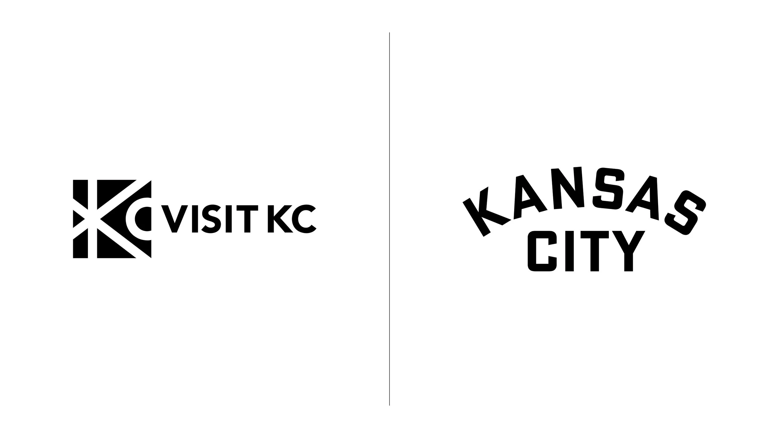
Our first priority was aligning on a visual direction. We needed to bridge the gap between their longstanding brand and a more vibrant campaign identity. The solution: lead with the campaign’s energy—its logo, colors, and tone—and relegate the legacy logo to a more formal, secondary role.
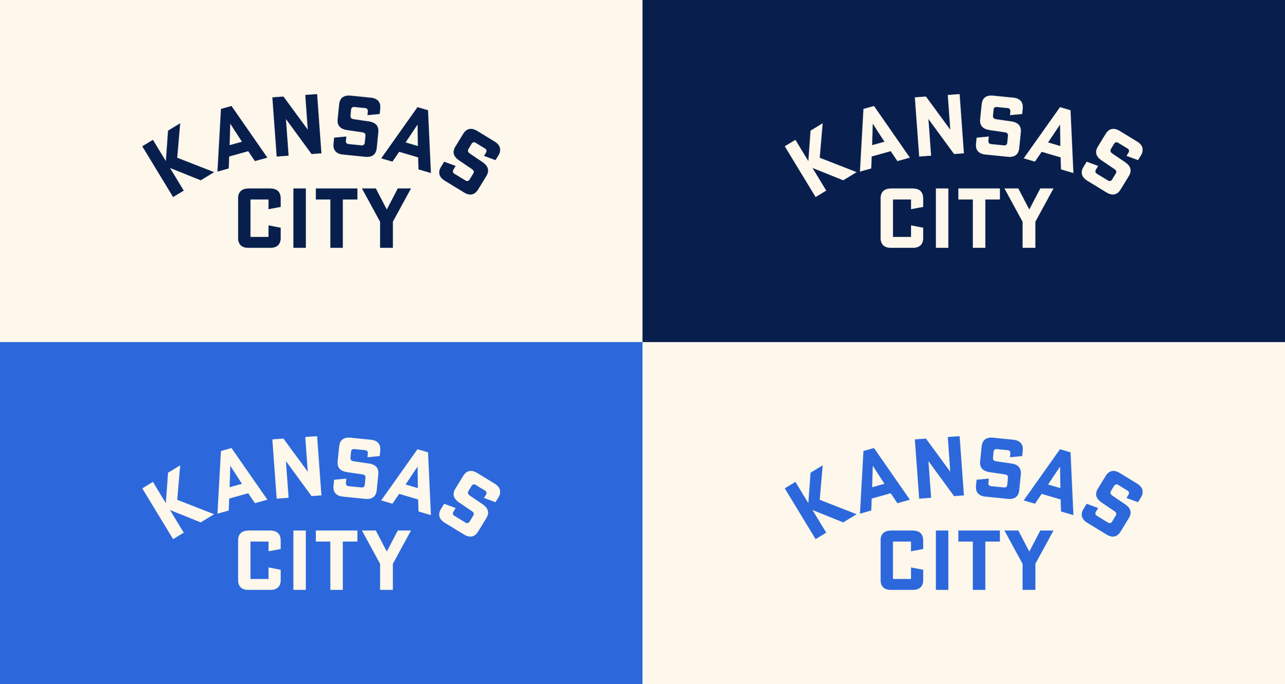
In the final guidelines, we evolved their core blues and swapped out cold grays and muddy accents for a warm, welcoming cream that became the primary neutral. The result felt fresher, friendlier, and more aligned with how they wanted to show up.
Design process
This massive site — hundreds of pages, listings, and content types — demanded a flexible, scalable system that never felt templated. I designed nearly two dozen pages across desktop and mobile to align with the client—everything from the homepage to event listings, blog templates, and contact forms.
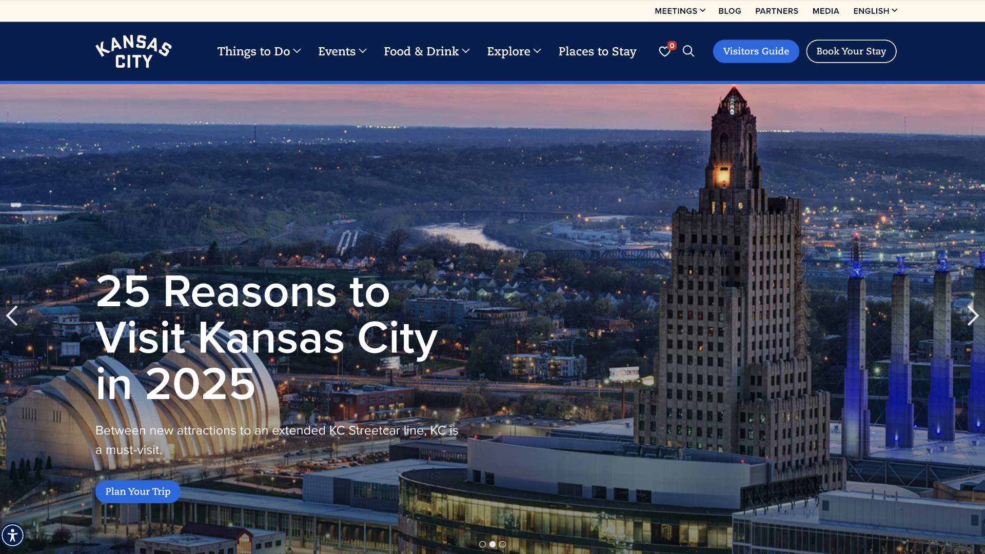
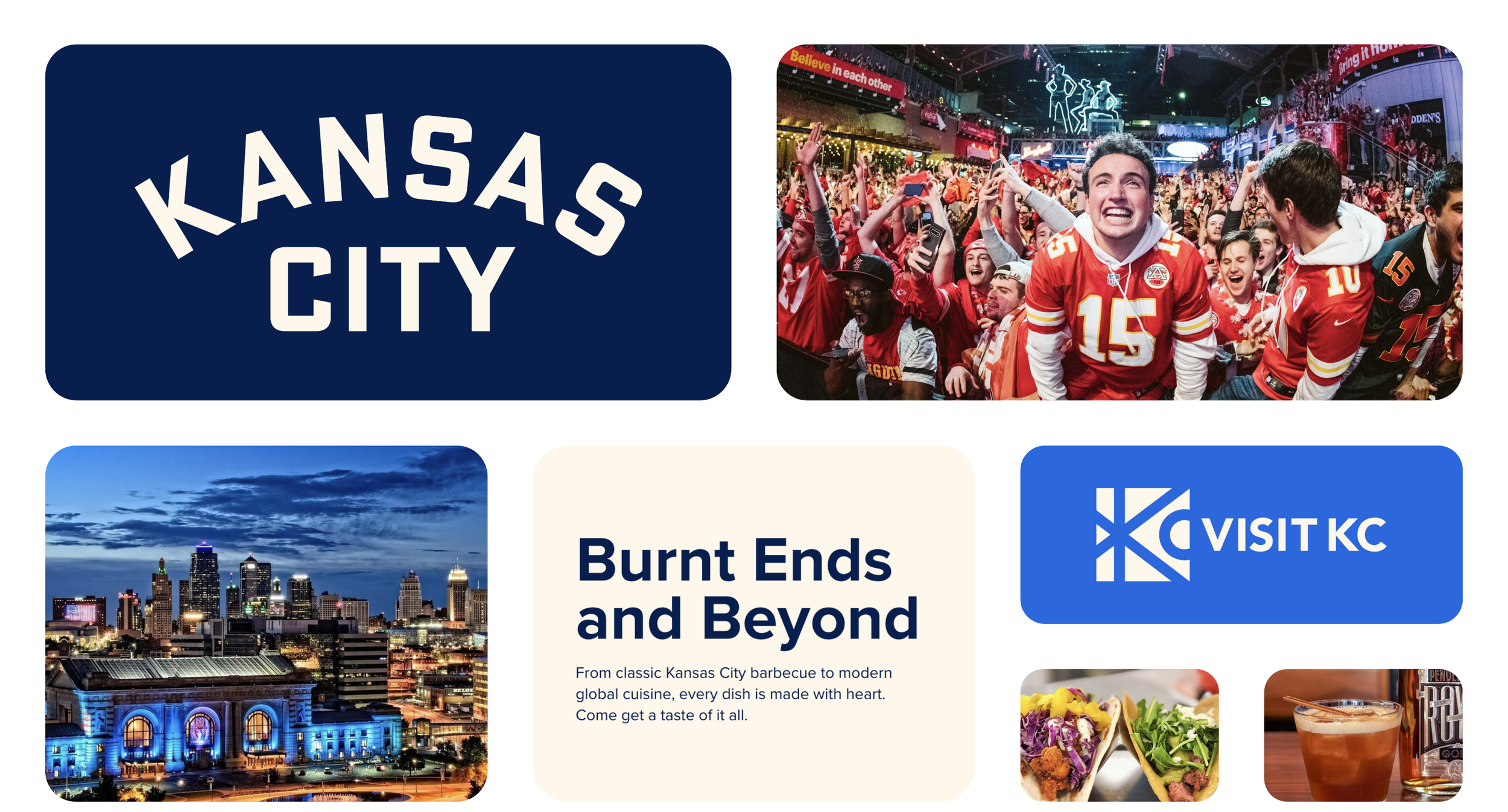
With VisitKC’s stunning photo library at our fingertips, I let imagery lead the design. From a bold navigation grid to modular card templates for events, businesses, and articles, every screen is rich, immersive, and easy to explore.
We also wove in one of the city’s most iconic symbols: the KC heart. A decades‑old emblem of civic pride, it became both a “favorites” icon and a discreet footer sign‑off, bringing a quiet, heartfelt signature to every page.


Outcomes & impact
This project was as much about structure as it was about style. The final site brought clarity to a dense content ecosystem, smoothed out the user journey, and gave VisitKC a digital presence that finally matched the strength of their brand.