
Redesigning the agency I work for (no pressure)
About the project
After 20 years with the same logo, Envisionit needed a fresh look—one that honored its legacy but moved the brand into the present. The original mark felt dated, and years of fragmented sub-brands had diluted its clarity. Here’s what I did:
Internal rebrand of a 20-year-old agency
Led full identity refresh, from logo to vertical strategy
Unified three key business verticals under one cohesive system
Rolled the rebrand into a bolder, more modern website redesign

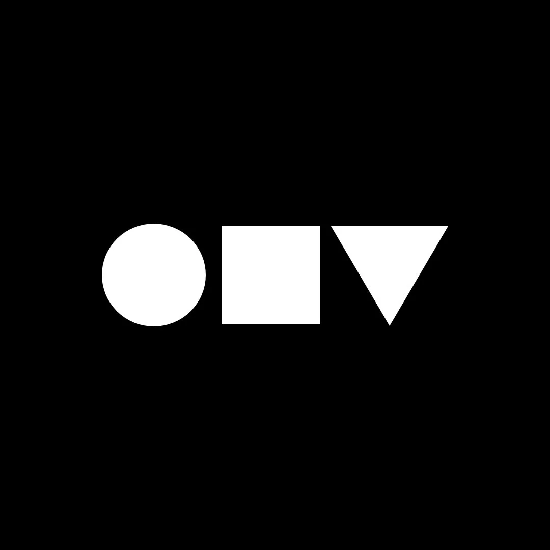
Legacy logo
Design process
We approached the rebrand like we would for any external client, with the executive team acting as stakeholders. I began by presenting a range of logo directions—from refined evolutions to total departures.
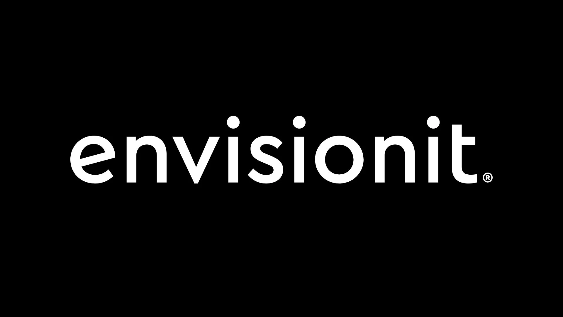
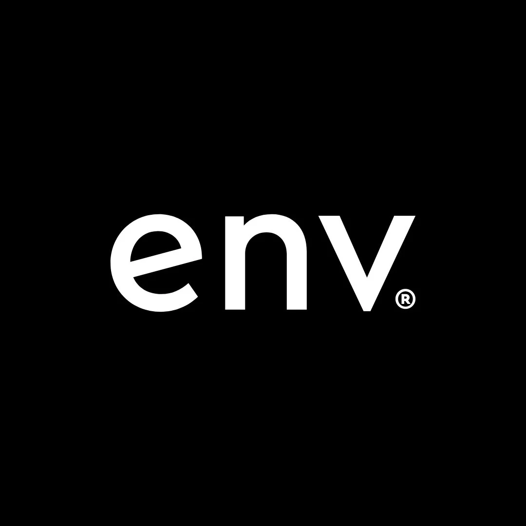
In the end, we landed on a modernized version of the original wordmark: lowercase, slightly tracked out, now set in Cera Pro. I kept a few signature quirks—the tilted “e” and single-crossbar “t”s—to preserve continuity and character. The outdated icon was replaced with a new shorthand: env. As a bonus, the three-letter abbreviation yielded simple geometric shapes—building blocks that became a recurring visual motif.
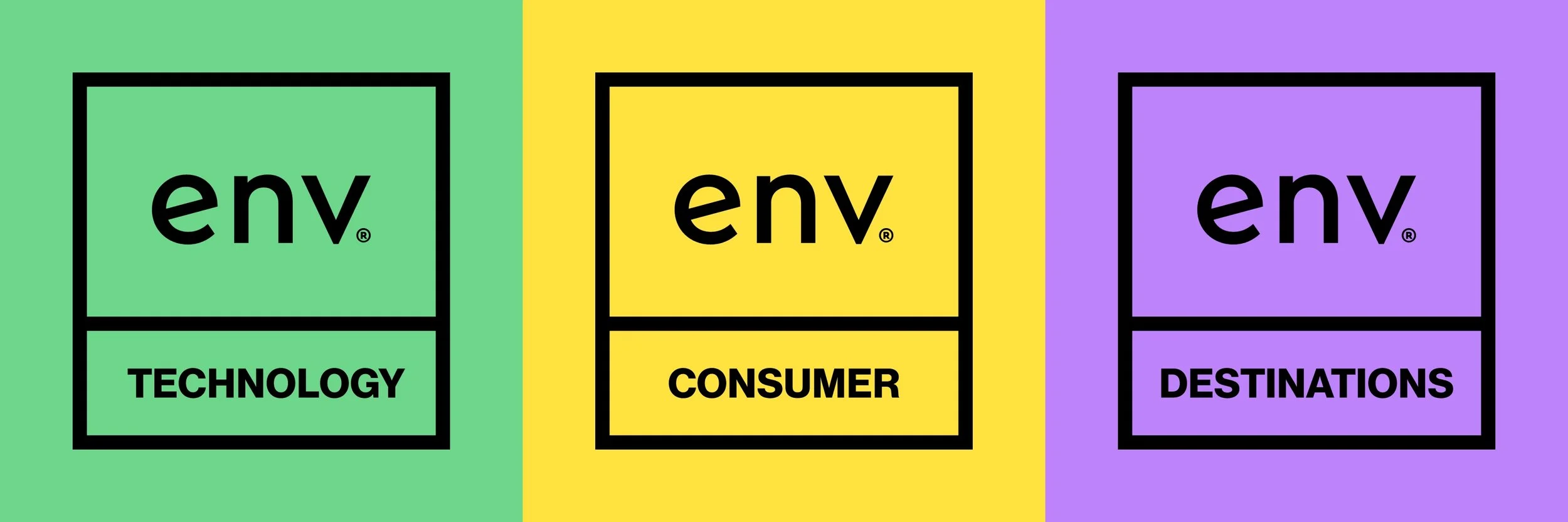
One of the most impactful shifts came in simplifying the brand architecture. Instead of separate logos and color palettes for each business vertical, I folded everything under a unified system. Each of the three verticals—Technology, Destination, and Consumer—received a distinct color pulled from an expanded brand palette. Agency Blue was reserved for the master Envisionit brand, while the sub-brands favored a more modular, expressive approach.
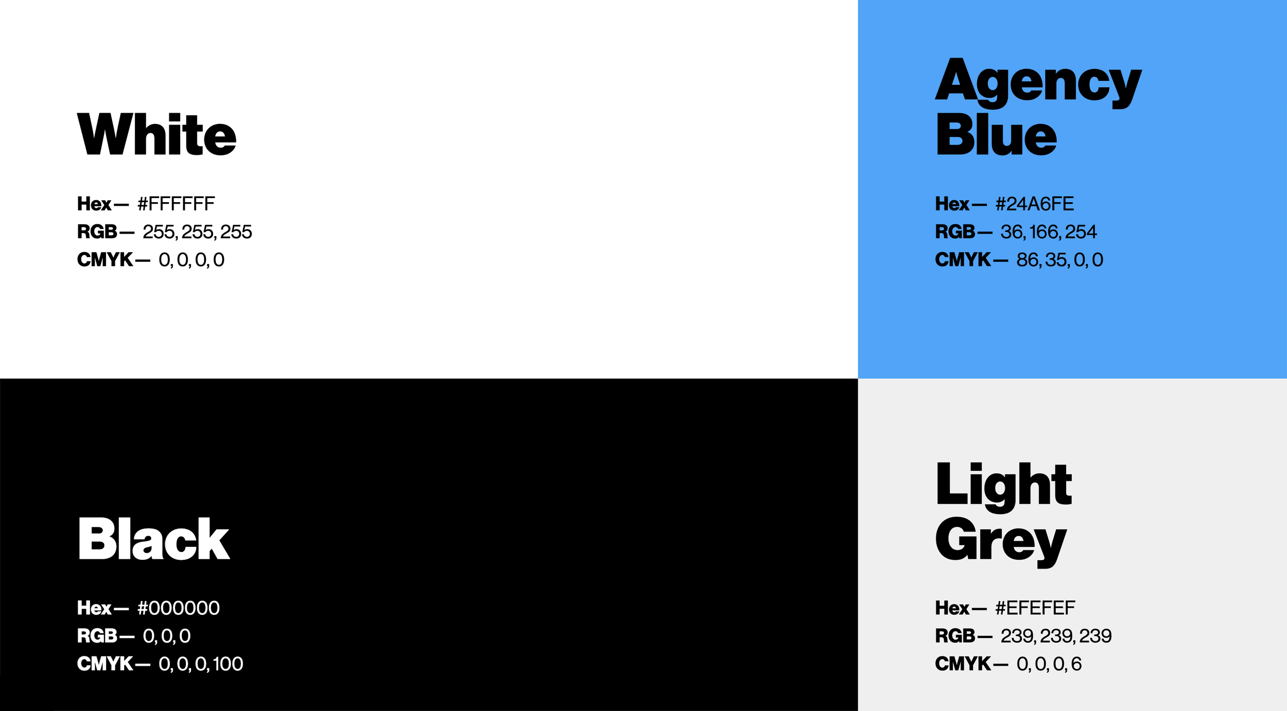
Primary colors
I also selected a unique-open source icon library for use on our website and in client-facing collateral. I expanded on the already robust icon set with proprietary icons, featuring illustrations like digital ads, out of home ads, high, medium, and low priority indicators, team icons, and dozens more—all following the same structure as the original icons.
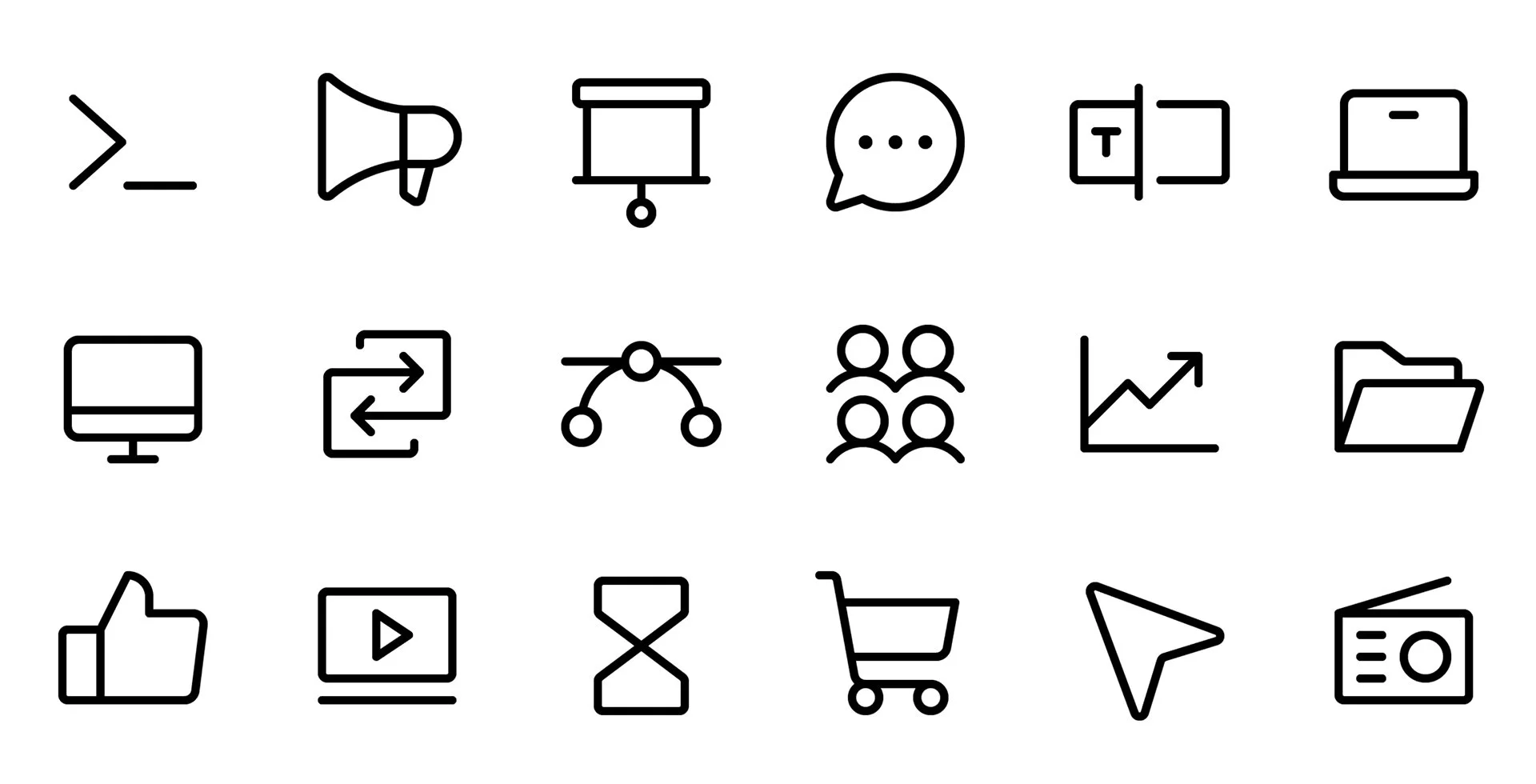
Open-source icons

Custom icons
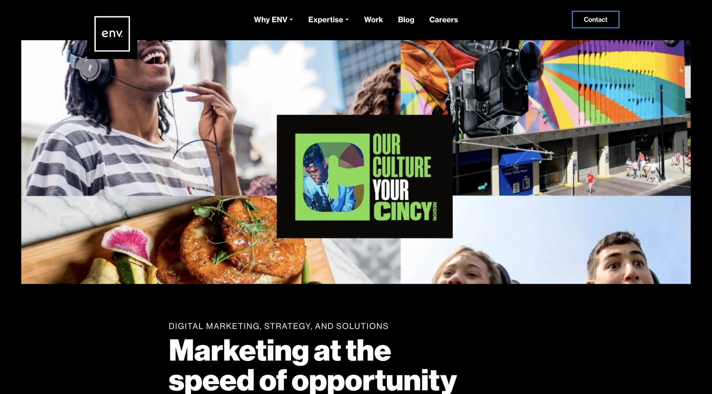
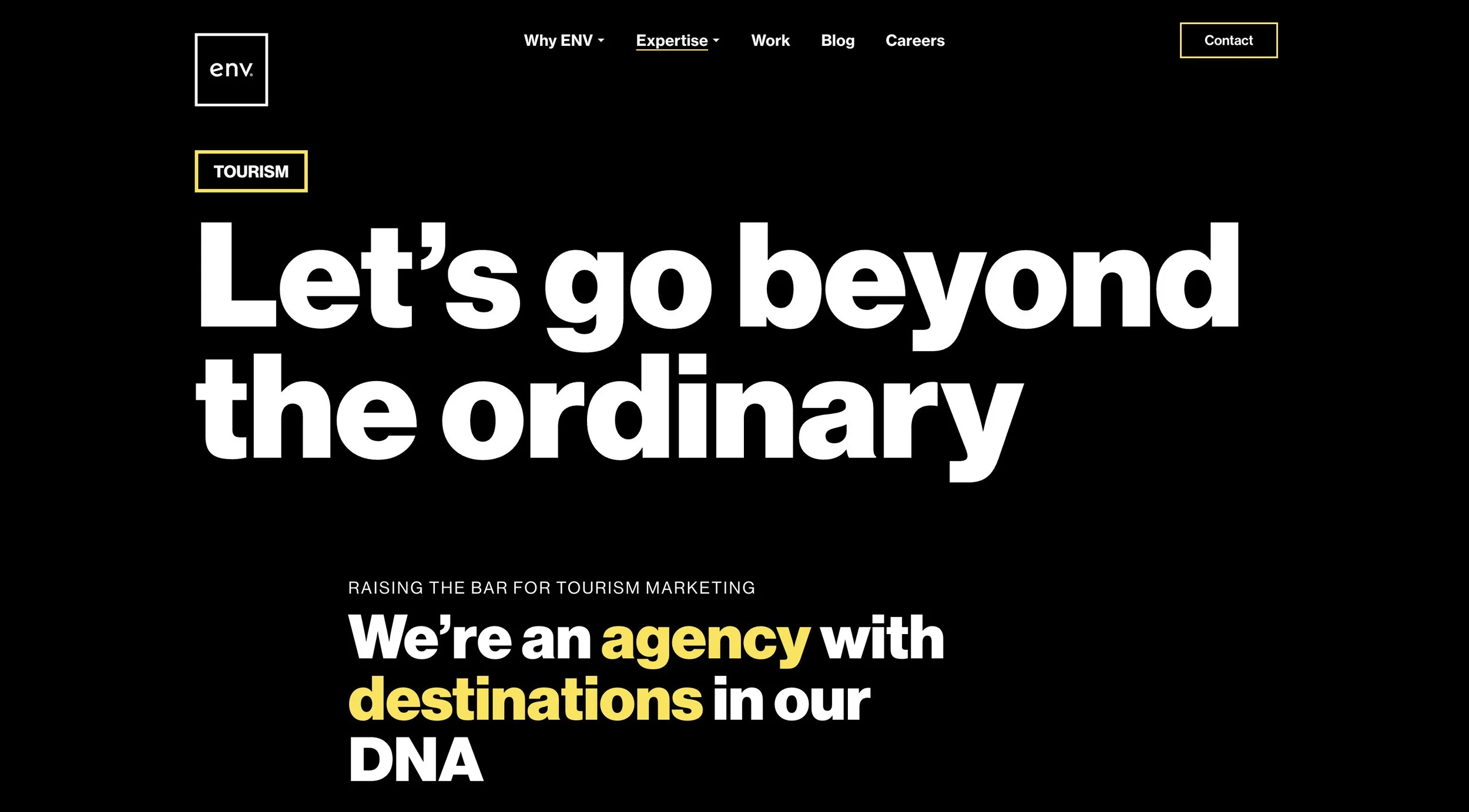
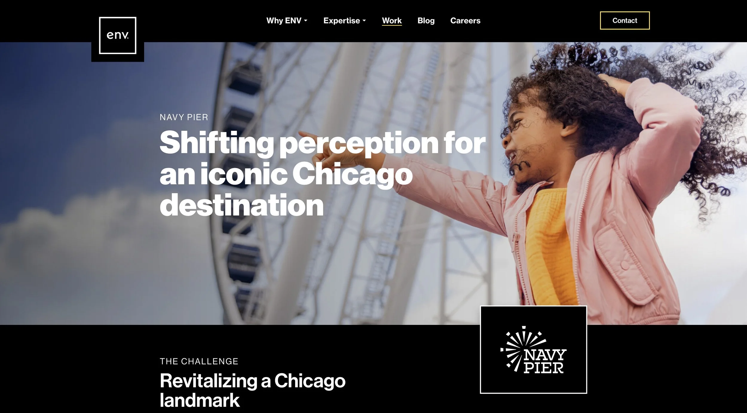
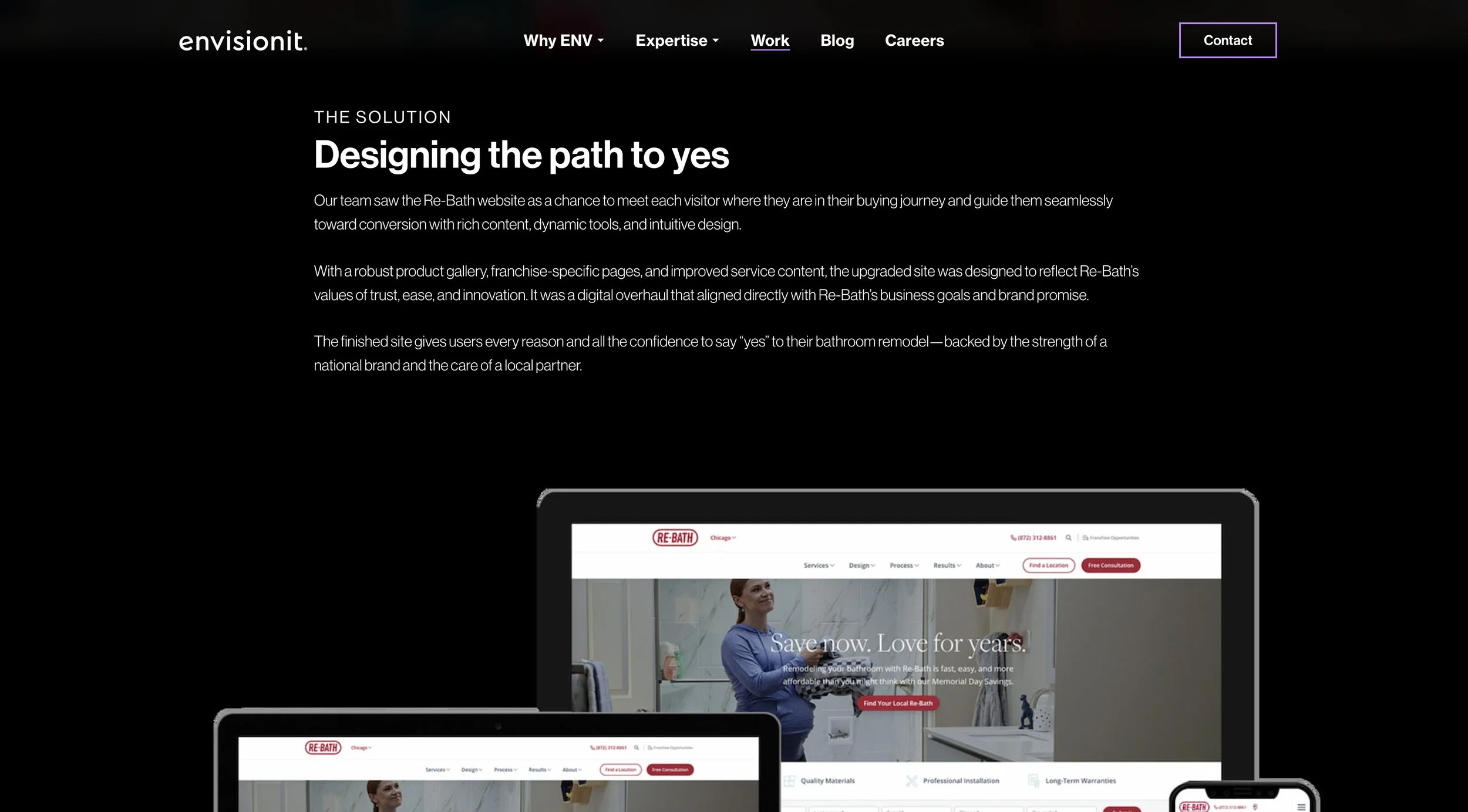
Website design
Once the visual system was locked in, I turned to the website. Partnering with our dev and SEO teams, I redesigned the core site structure: homepage, case studies, hiring pages, thought leadership, and new vertical hub pages. The result is bolder, clearer, and more reflective of who Envisionit is today.

Outcomes & impact
The rebrand was a major leap forward—internally celebrated, client-approved, and already integrated across our marketing, presentations, and paid campaigns.
It brought long-overdue cohesion to our identity and allowed the team to show up with more clarity and consistency across every touchpoint. And like any good brand system, it’s flexible enough to keep evolving.