
Redesigning the agency I work for (no pressure)
The challenge
After 20 years with the same logo, Envisionit needed more than a refresh— they needed a brand that could actually scale. The original mark felt stuck in 2004, and a mess of fragmented sub-brands had turned the identity into visual chaos. My job: modernize the brand without losing what made it recognizable, then rebuild the website to match.
What I Did
Led internal rebrand from strategy through rollout
Unified three business verticals under one cohesive system
Redesigned the website to reflect the new identity
Created a flexible brand system the team could actually use

Making sense of 20 years of brand chaos
The original Envisionit logo had character—quirky tilted letters, that single-crossbar "t"—but it was showing its age. Worse, each business vertical (Technology, Destination, Consumer) had developed its own identity over the years. Different logos, different colors, different everything. Clients were confused. The team was confused. I was confused.
I treated this like any external client project: presented a range of directions to the exec team, from careful evolution to total reinvention.

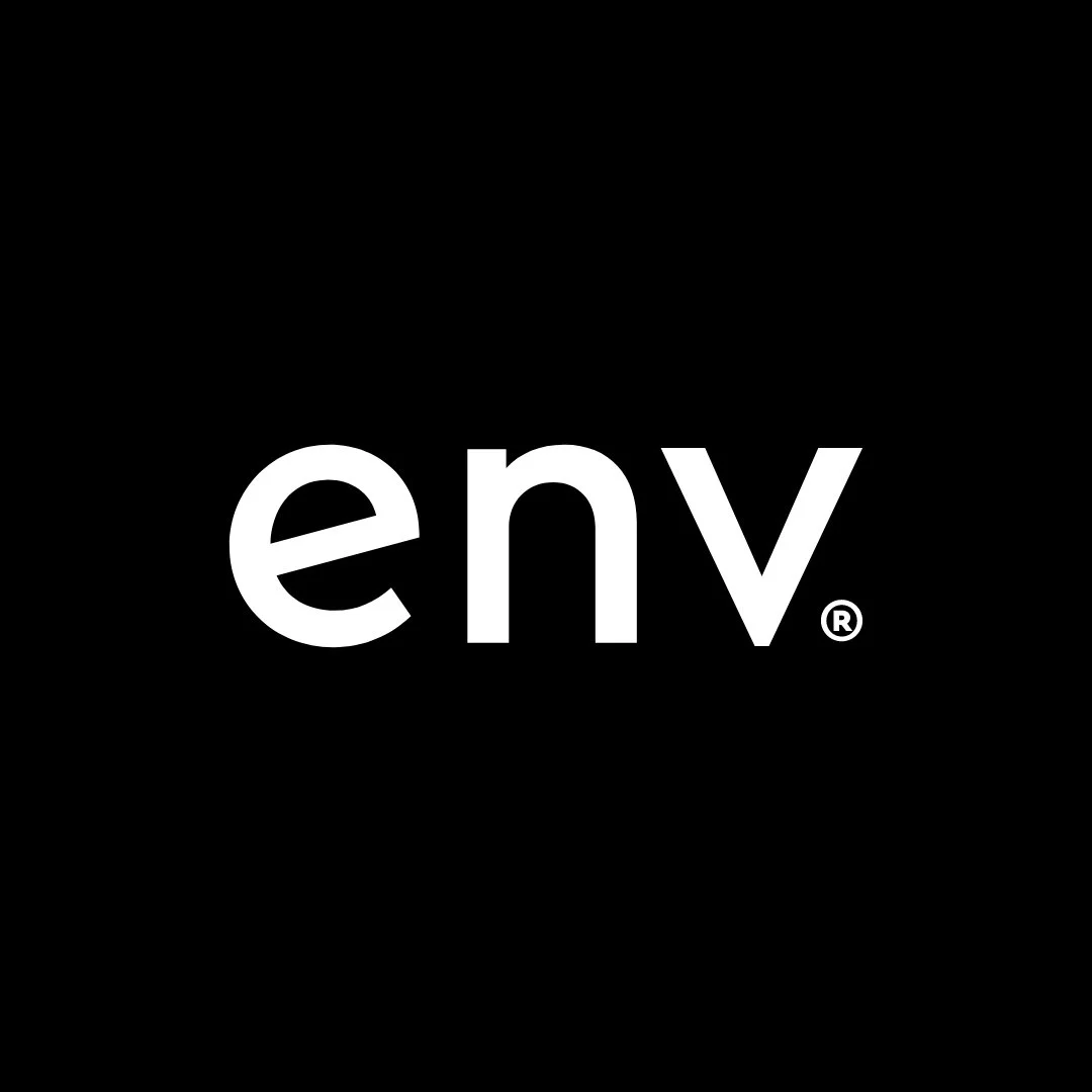
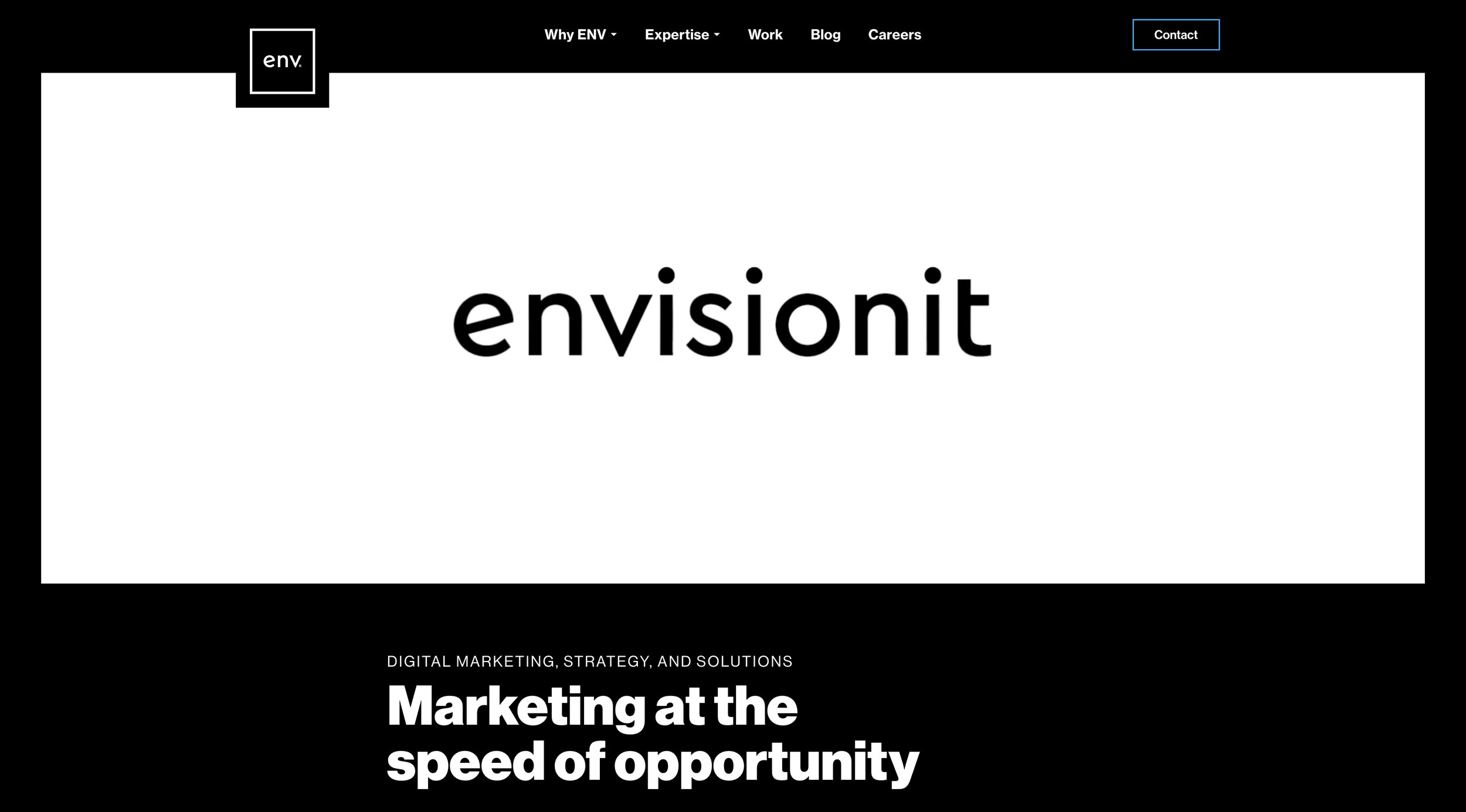
We landed on a modernized wordmark—lowercase, slightly tracked out, set in Cera Pro. I kept the quirky bits (the tilted "e," those single-crossbar "t"s) for continuity, but ditched the dated and mismatched icon.
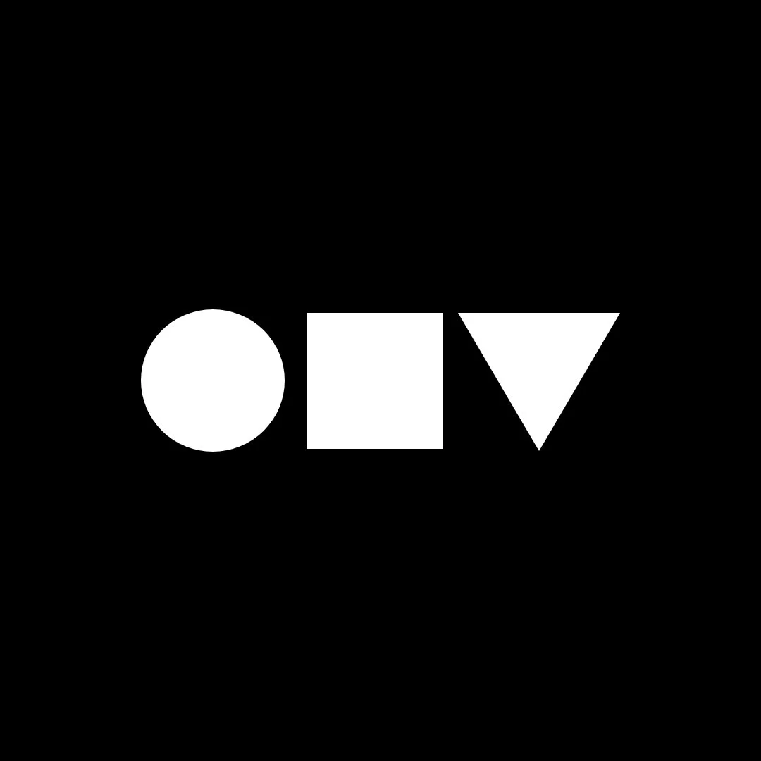
The new shorthand: ENV. Three letters that happen to make simple geometric shapes; building blocks that became the visual system's foundation.
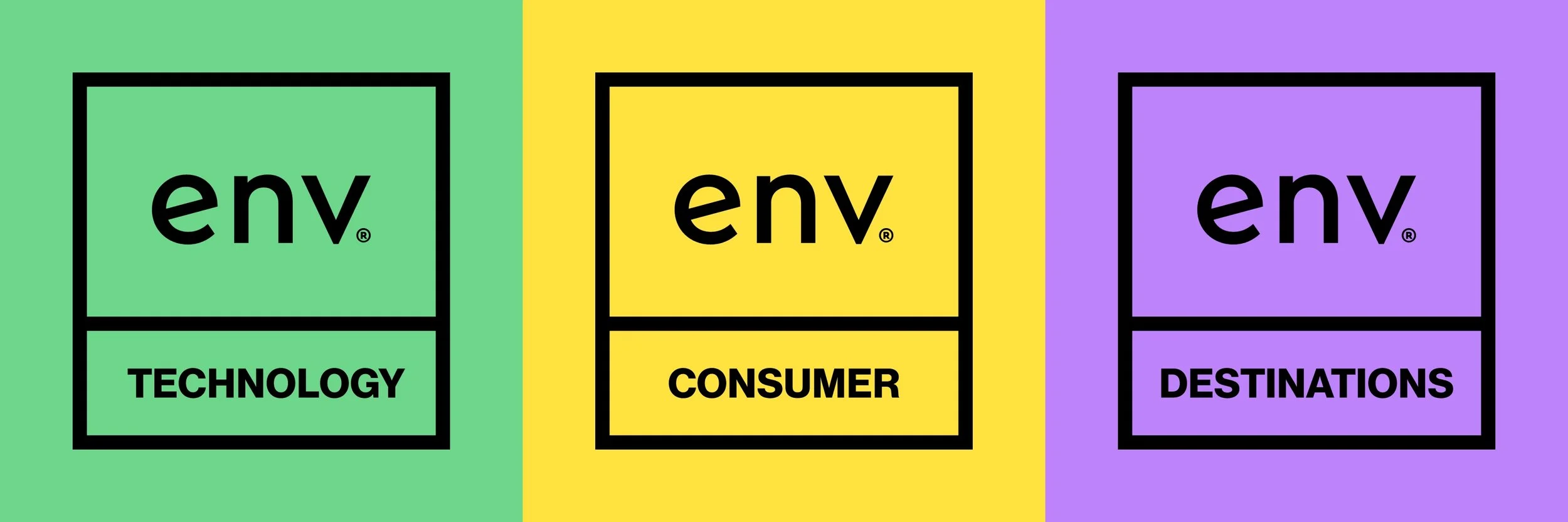
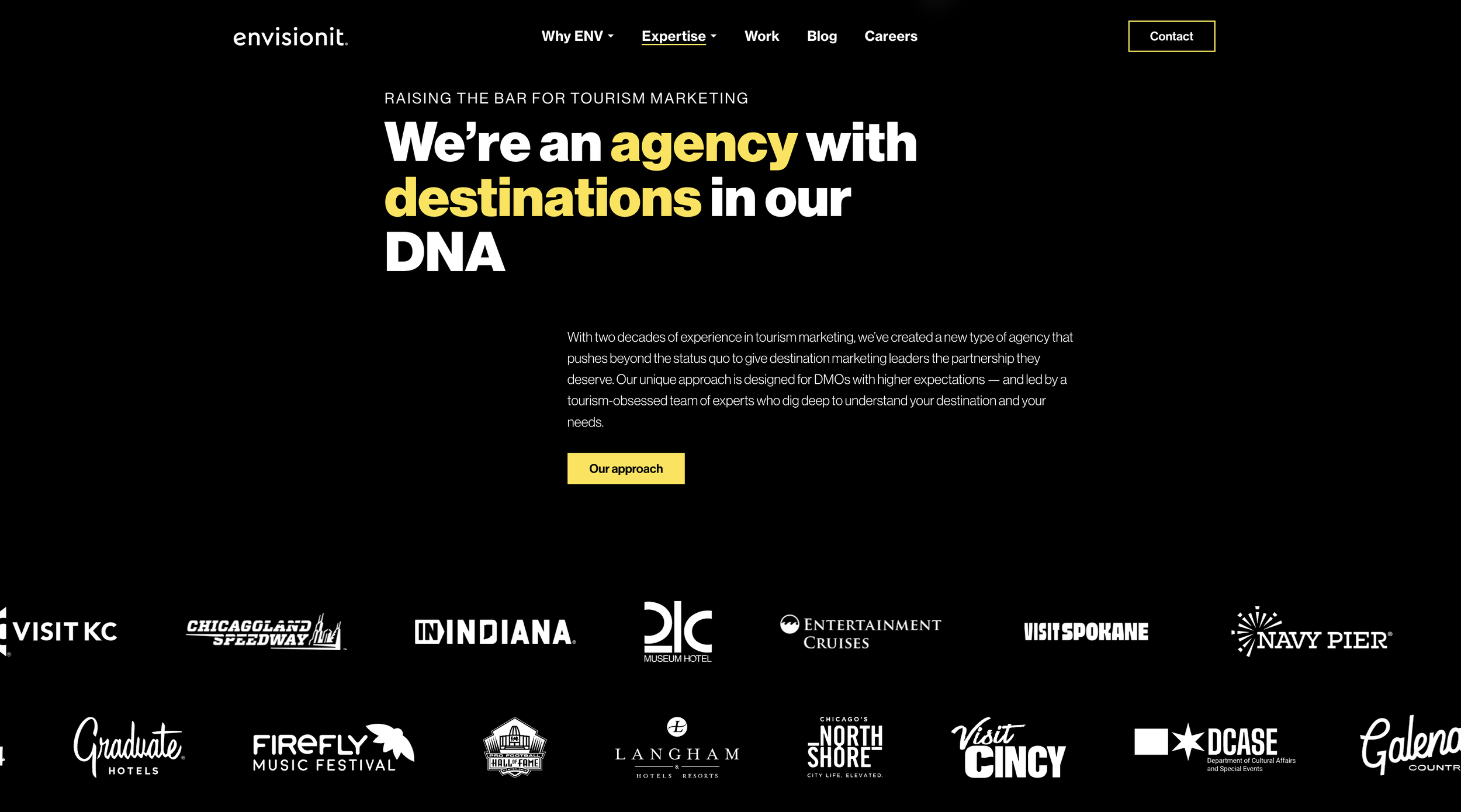
One brand, three verticals, zero confusion
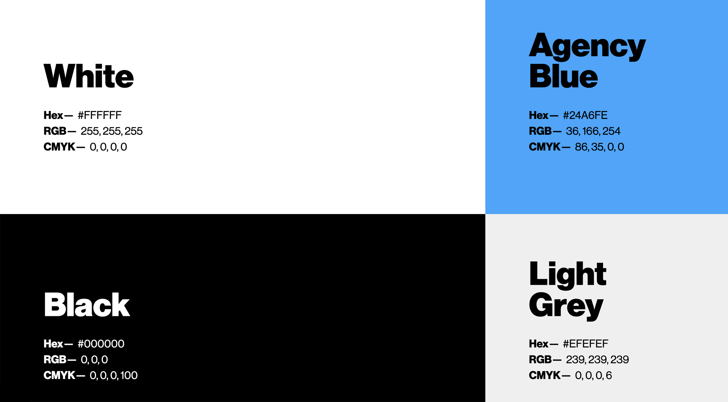
The biggest unlock wasn't the logo—it was simplifying the architecture. Instead of separate identities for each vertical, I built one unified system where each gets its own color from an expanded palette. Agency Blue stays reserved for the master brand. The verticals get to be expressive without spinning off into their own universes.
I also selected an open-source icon library (Phosphor) and expanded it with custom icons for agency-specific needs—digital ads, OOH, priority indicators, team structures. Dozens of new icons, all following the same structure so they feel like one cohesive set
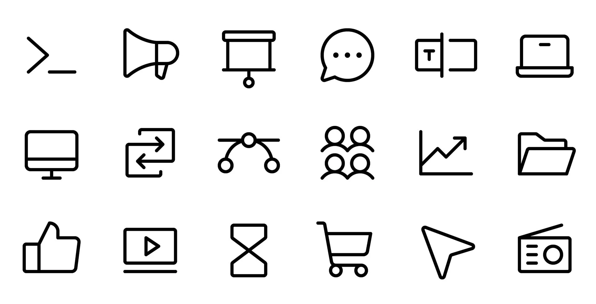
Open-source icons

Custom icons
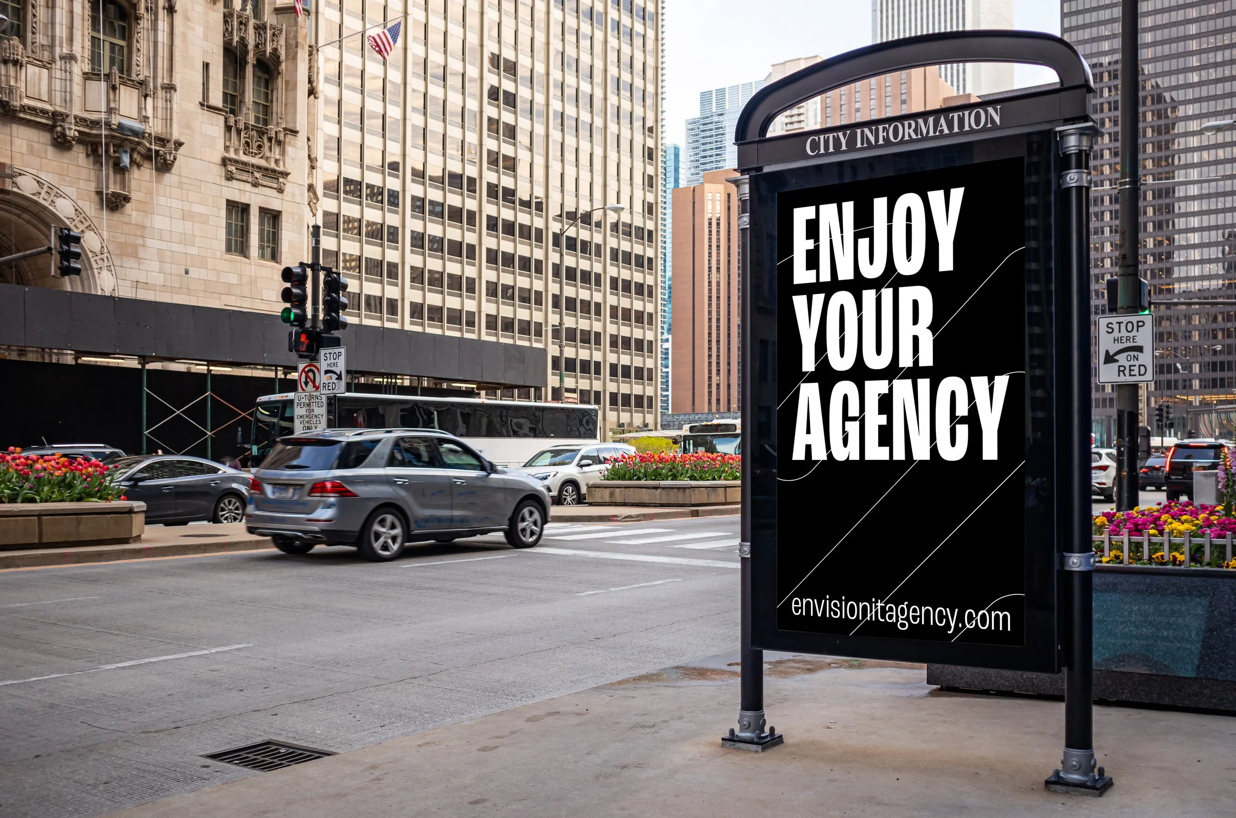
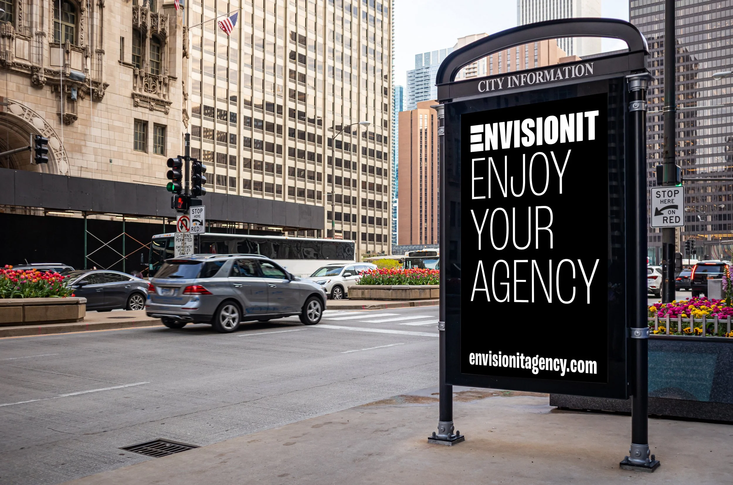
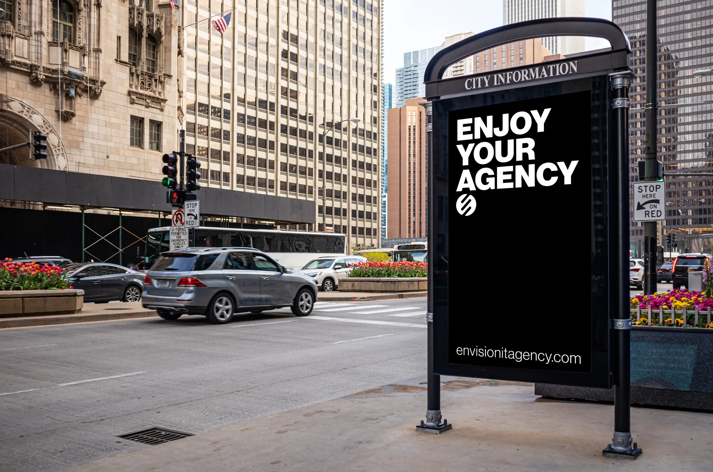
A website that reflects the ethos
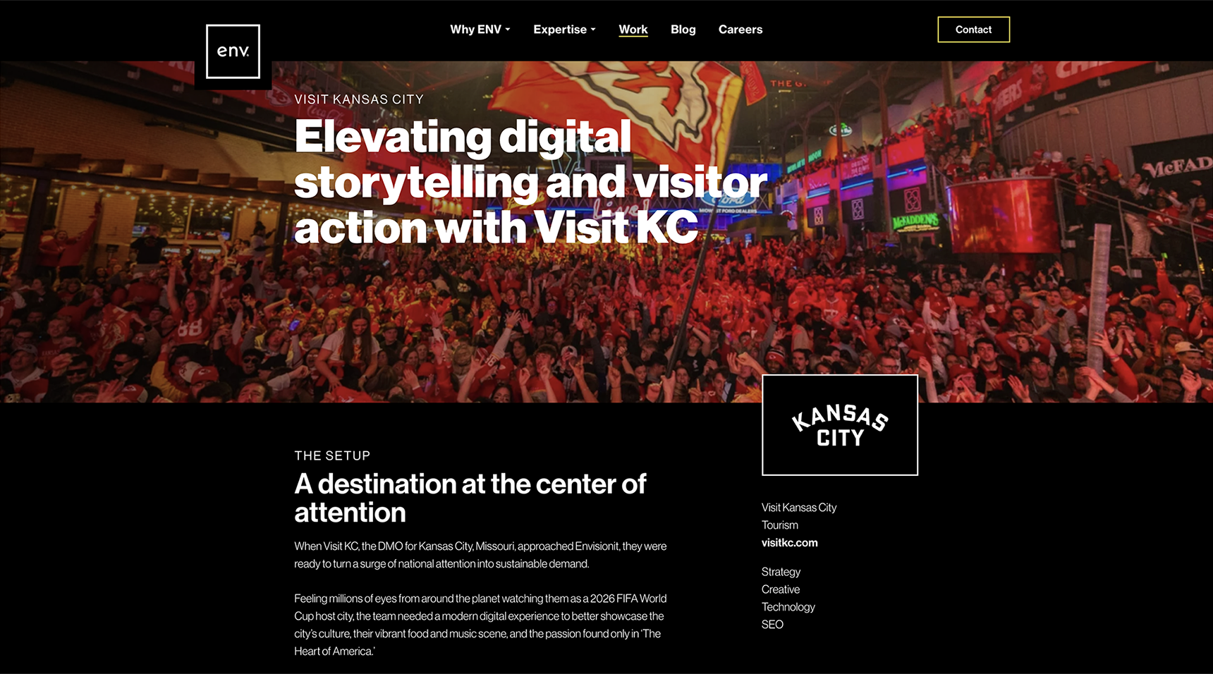
Once the visual system was locked, I redesigned the core site structure alongside our dev and SEO teams. Homepage, case studies, hiring pages, thought leadership, vertical hub pages, the whole lot. The resulting site is bolder, clearer, and actually representative of what Envisionit has grown into.
Outcomes & impact
We've increased profitability every year since launching the rebrand.
Beyond the numbers: the rebrand brought long-overdue cohesion to how the agency shows up. Marketing materials, client presentations, paid campaigns—everything finally looks like it comes from the same place. The team can actually use the system without needing a designer to hold their hand.
And like any good brand system, it's flexible enough to keep evolving as the agency grows.