
Three brands, four user journeys, and one very tight deadline
The Challenge
Pinnacle Fertility had acquired multiple regional fertility clinics and rebranded them under one name. The problem? They still had completely separate websites for fertility services, egg banking, and surrogacy—each with different branding, different user flows, and different levels of polish.
They needed to consolidate everything into a single platform that could handle vastly different customer journeys (hopeful parents, egg donors, surrogates, LGBTQ+ families) while maintaining trust and clarity. Oh, and they needed it fast, on a tight budget, with a WordPress template system they could manage themselves.
No pressure.
What I Did
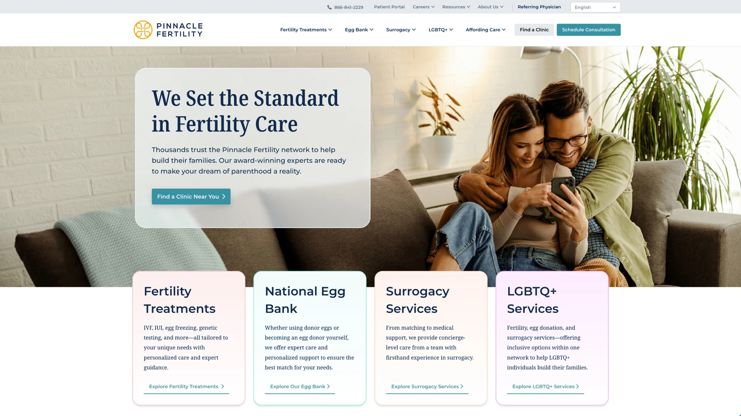
Consolidated five separate websites into one unified platform
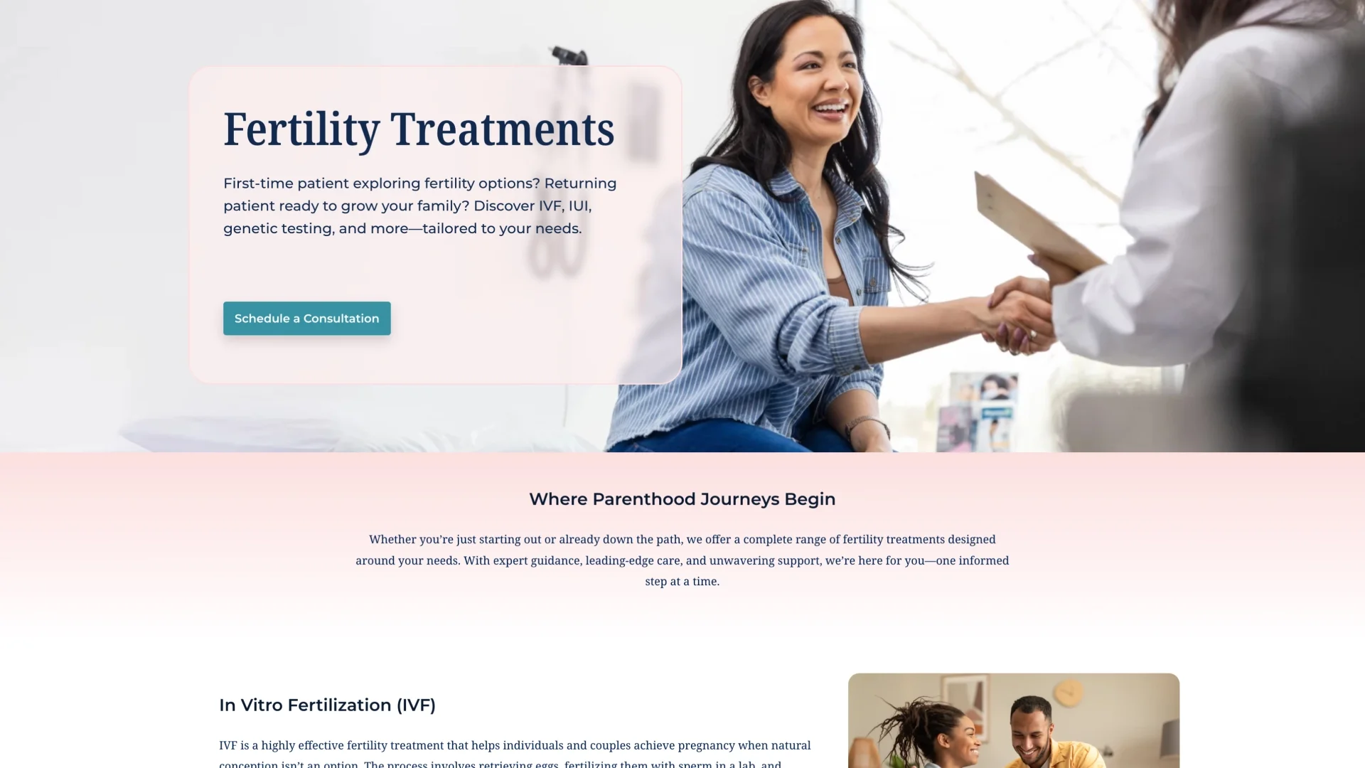
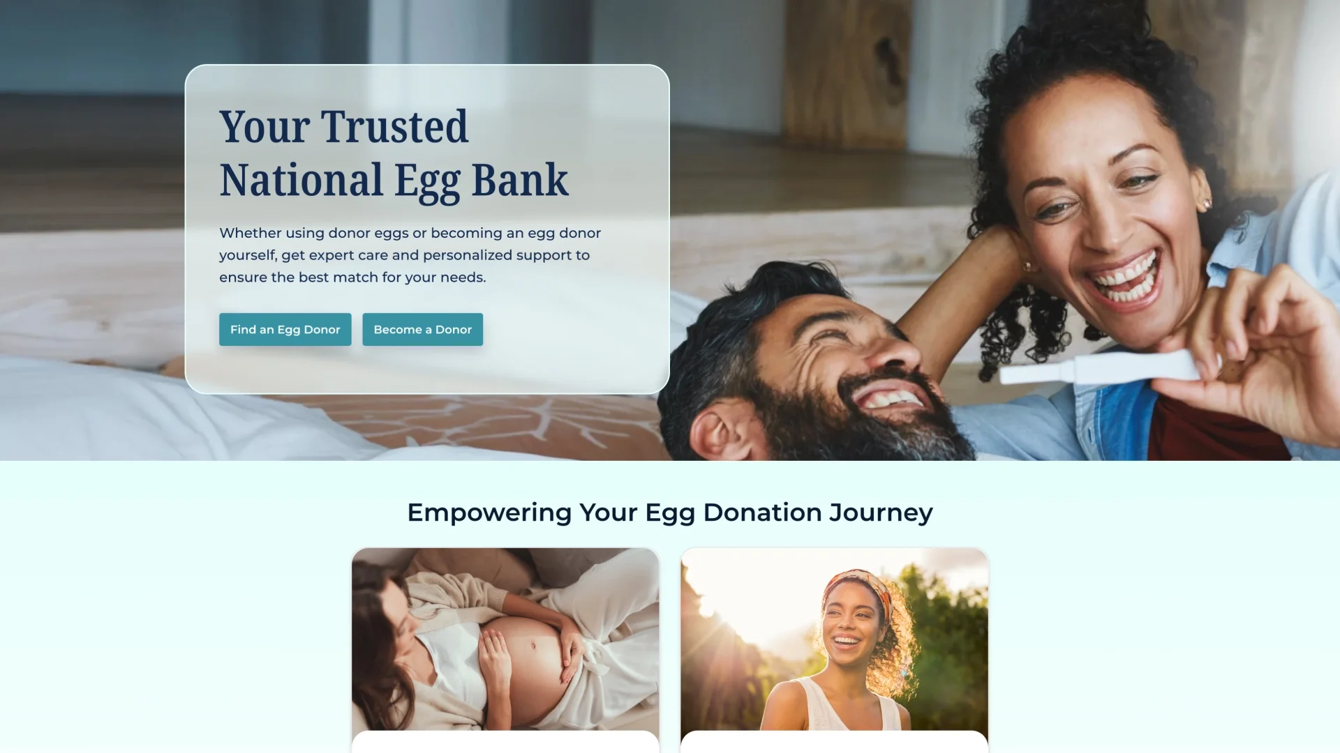
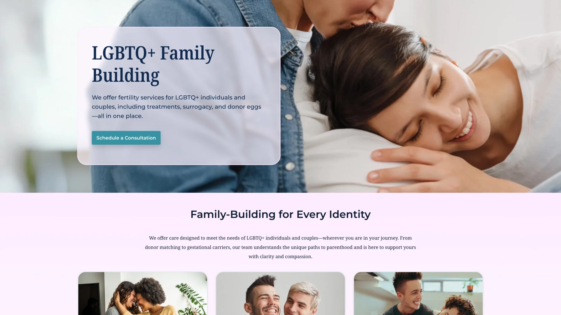
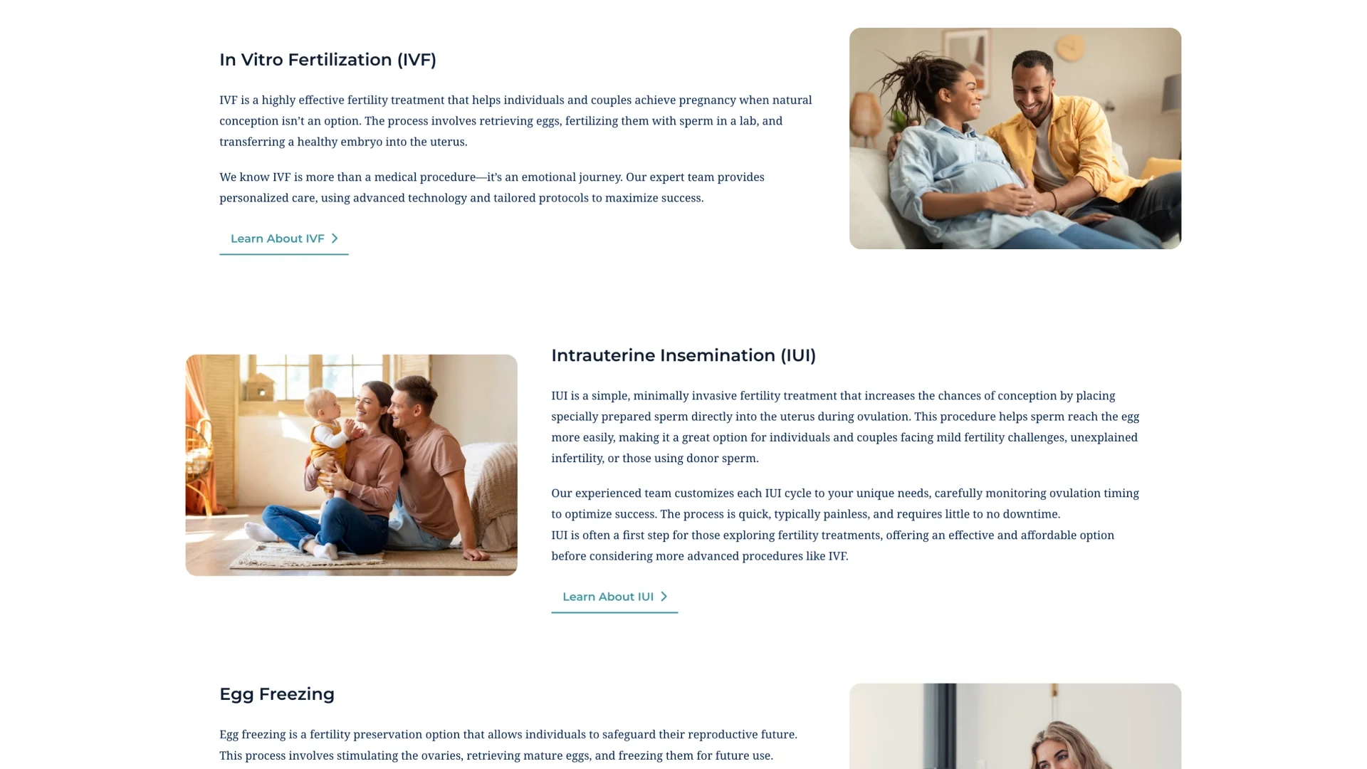
Designed site architecture and user flows for four distinct service journeys
Created a flexible design system using legacy brand colors as journey identifiers
Designed 12+ custom page templates plus 24 drag-and-drop WordPress modules
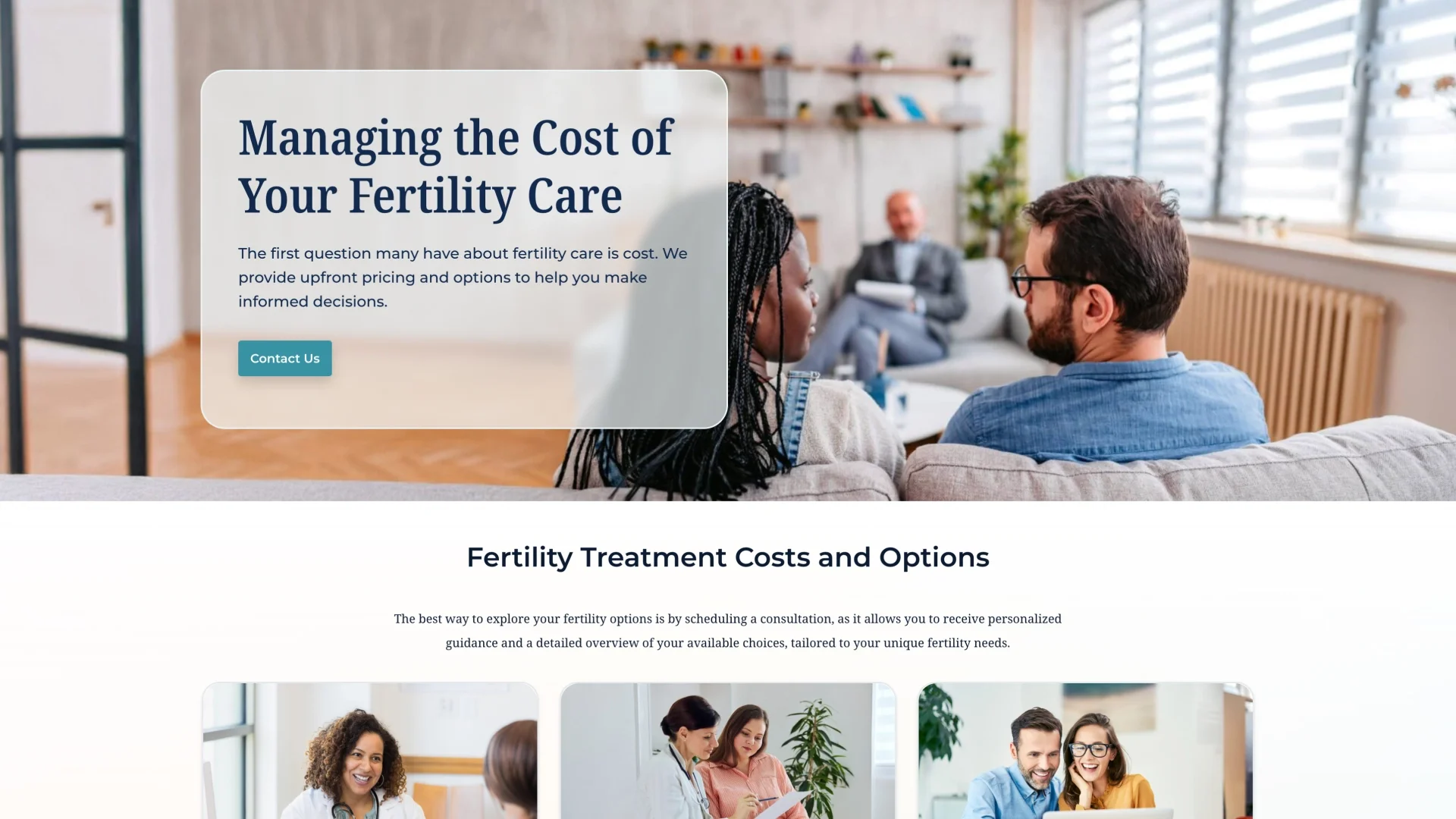
Prioritized conversion with strategic CTA placement throughout
Four journeys, one destination
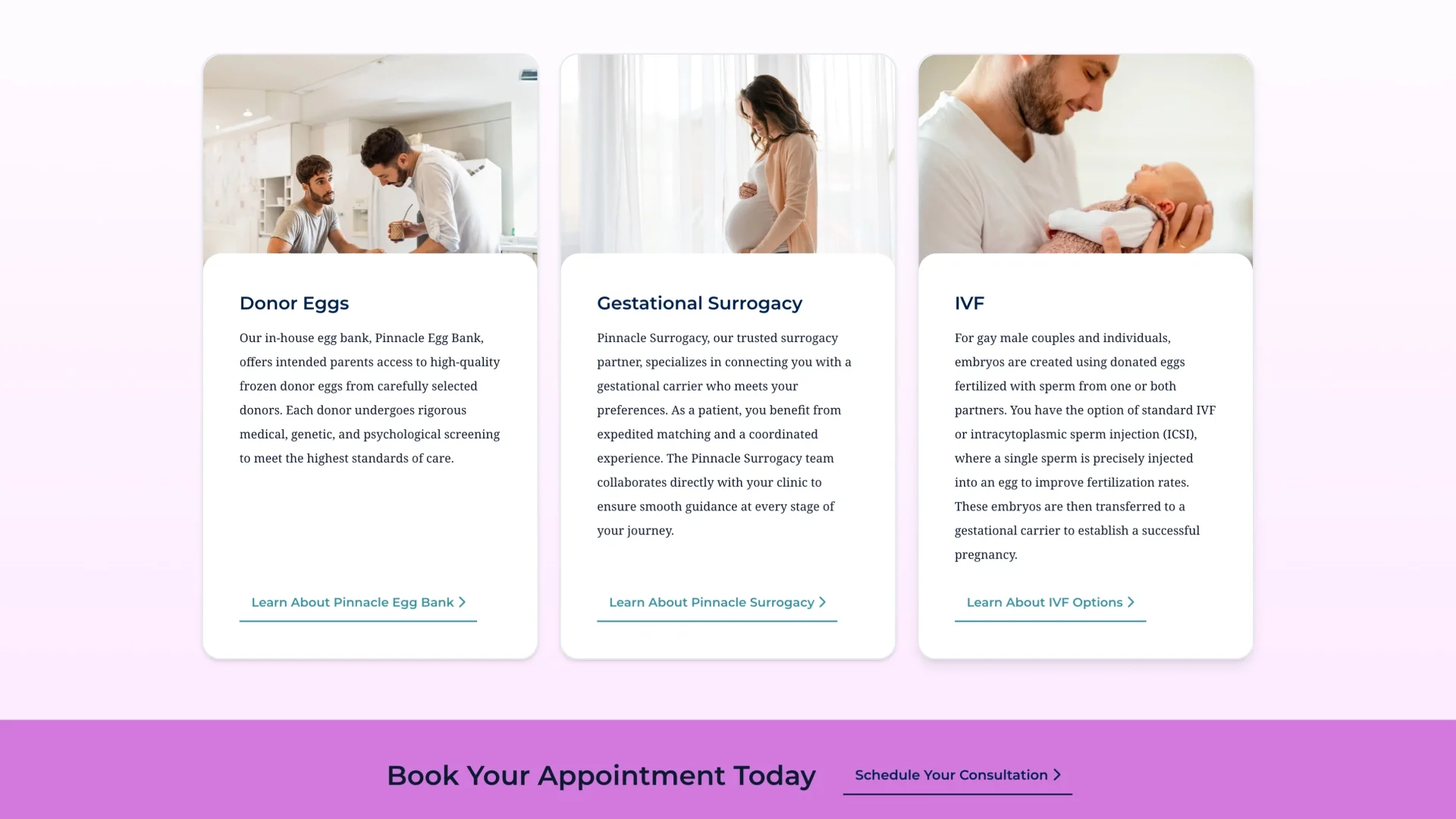
The biggest challenge wasn't visual design—it was untangling the information architecture. We had four primary user paths (fertility services, egg banking, surrogacy, LGBTQ+ services), each with completely different needs and goals. I started by mapping site structure and user flows with our strategy team.
The primary conversion goal: get people to call and book appointments. Secondary: contact form submissions. Every page needed to guide users toward one of these actions without feeling pushy or transactional—not easy when you're dealing with deeply personal medical decisions.
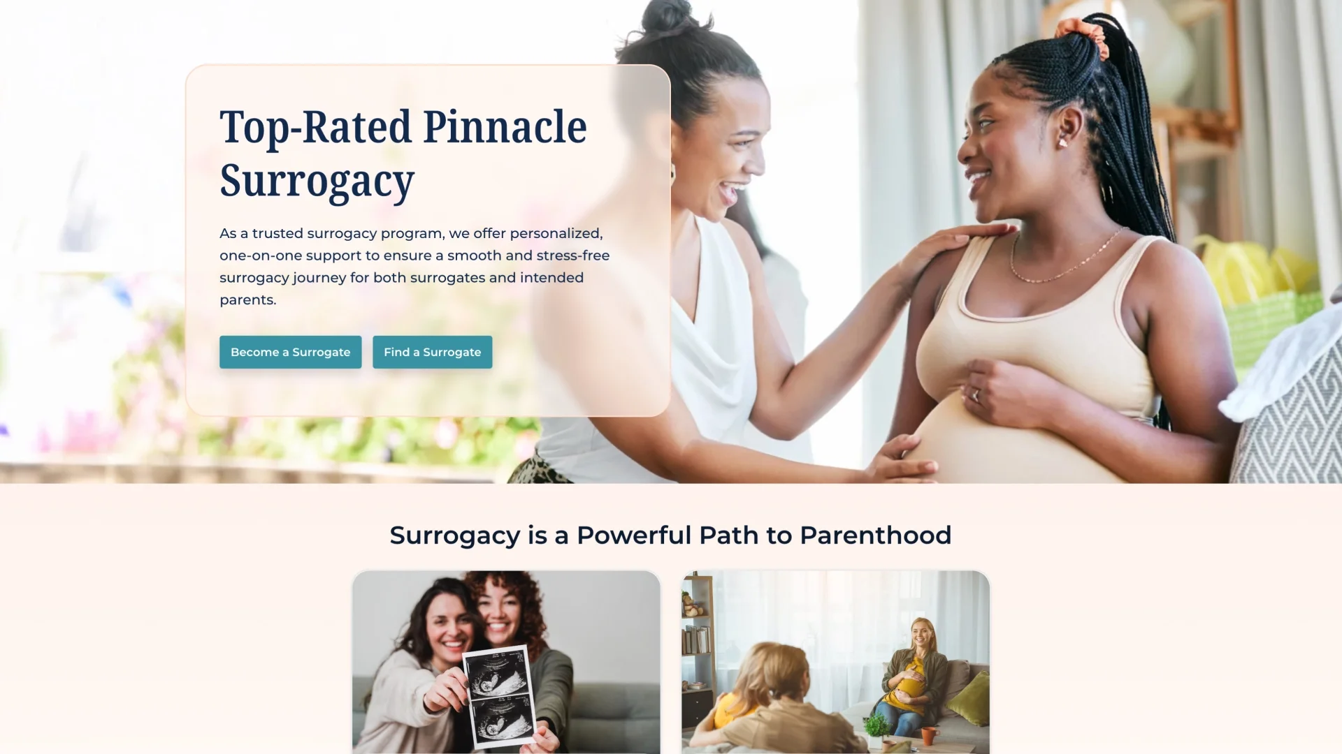
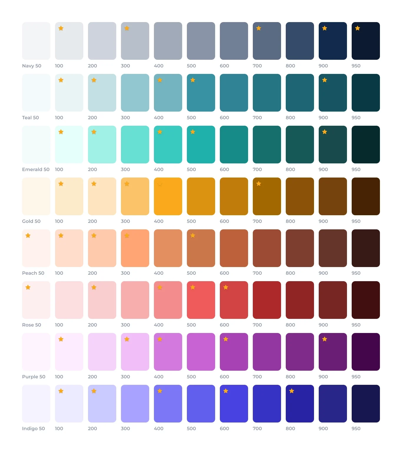
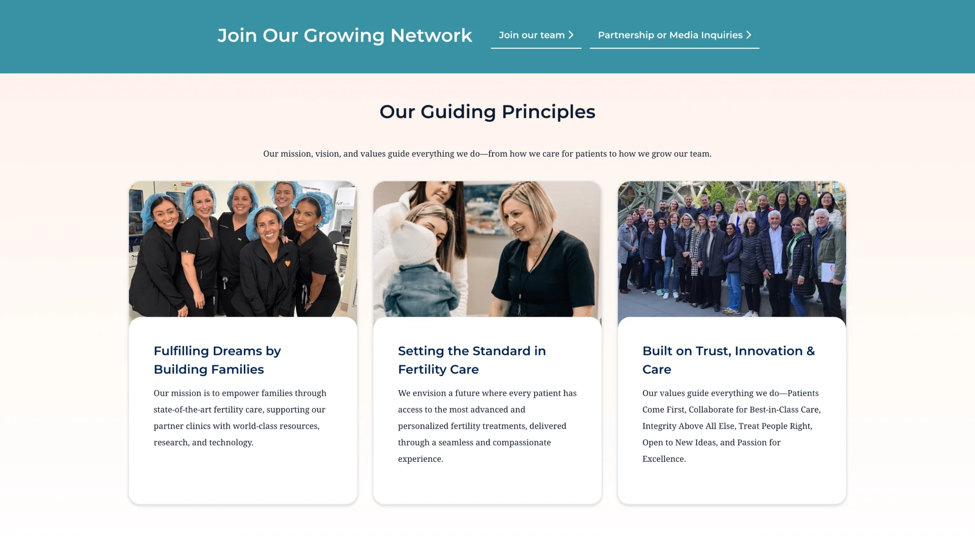
The brand evolution was just as complex. Their previous sites were loud and punchy, but the client wanted something softer, more soothing—professional and trustworthy for medical services but warm enough for the emotional journey people were on.
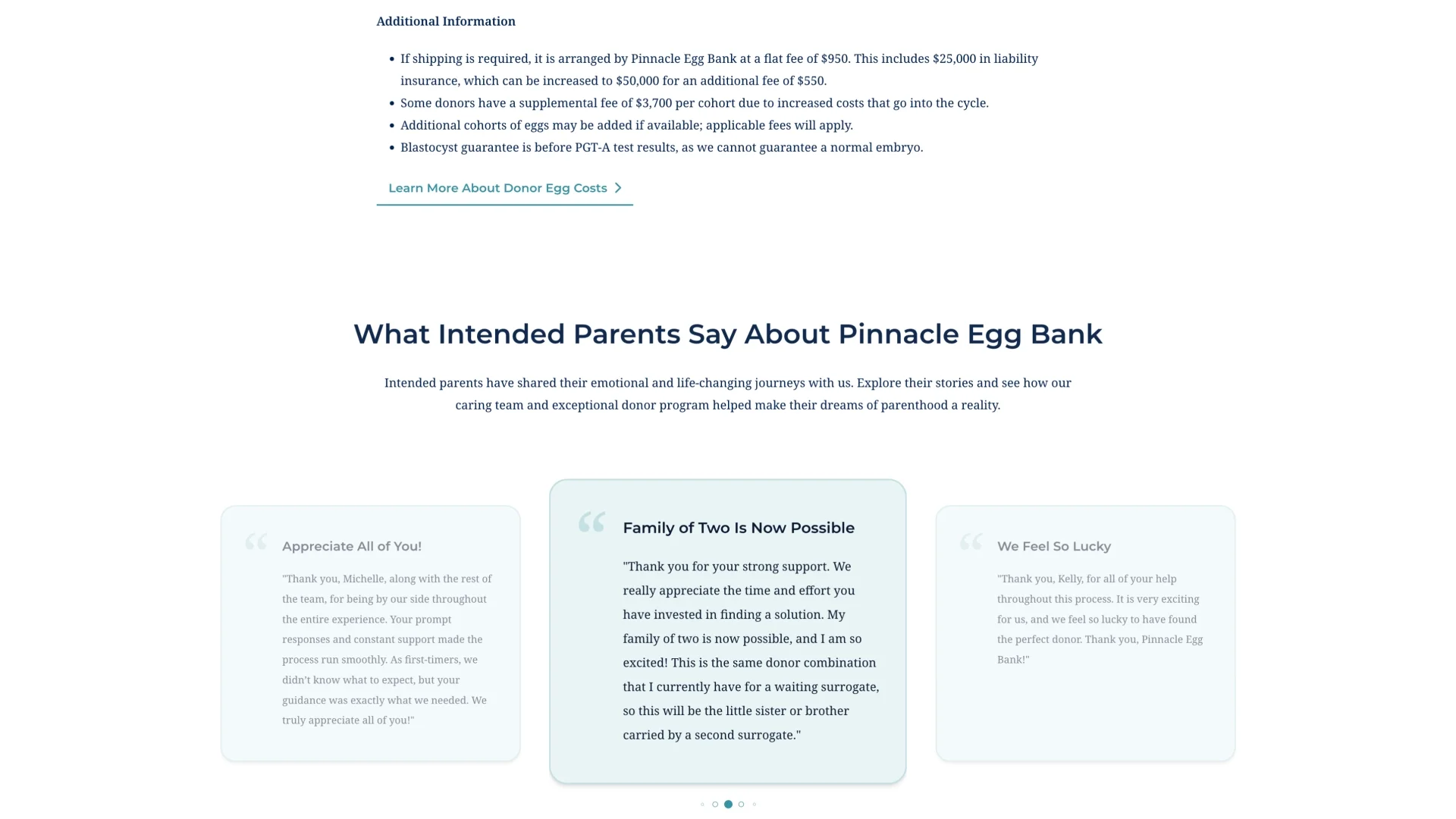
I pulled legacy colors from their existing properties (yellow from Pinnacle Surrogacy, teal from the egg bank) and added rose for fertility services and purple for LGBTQ+ families. Each color became a wayfinding tool—helping users immediately know which journey they were on while maintaining overall brand cohesion.
Built for speed and flexibility
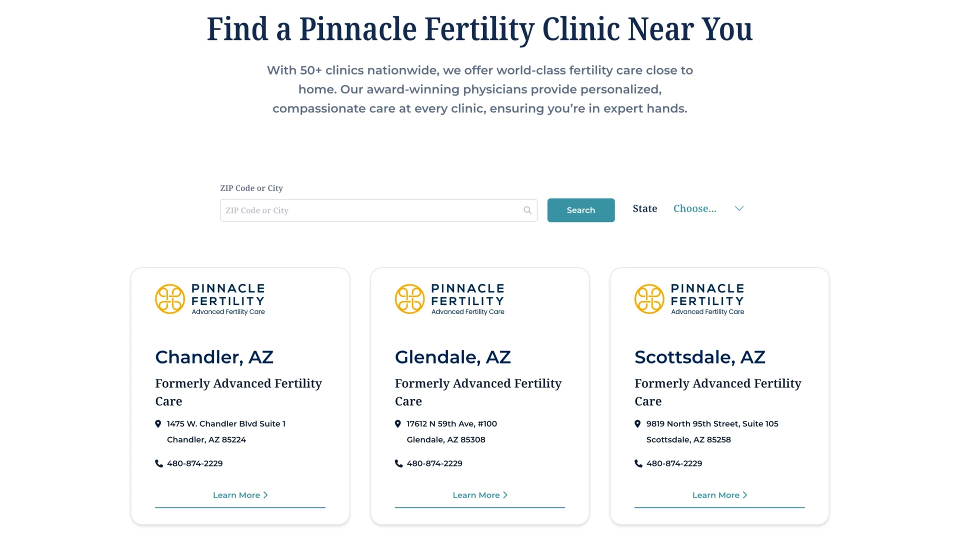
The client needed to move fast and maintain the site themselves, so I designed a system that could scale: 12+ bespoke page templates for core experiences (service pages, location search, individual clinic pages, blog, contact forms) plus 24 drag-and-drop WordPress modules they could mix and match to create new pages without a designer.
The templates handled the heavy lifting—location finders with filtering, service-specific landing pages with clear CTAs, individual clinic pages with consistent structure—while the modular system gave them flexibility to respond to marketing needs and regional variations..
The outcome
A consolidated platform that unified five disparate brands under one roof, with clear user paths for four distinct audiences and a flexible system the client could manage independently.
The project taught me a lot about managing complex stakeholder dynamics, tight budgets, and shifting expectations. Not every client relationship ends perfectly, but the work itself solved the problem we were hired to solve: turning fragmented web properties into one cohesive experience.
The site launched successfully and served the business need, even if the relationship didn't continue long-term. Sometimes the work speaks for itself, even when the circumstances don't.
Note: The site has been modified since our work, but the core structure and user flow architecture remain at Pinnacle Fertility.