
Turning Kansas City's tourism site into a destination itself
The Challenge
Visit Kansas City had the world's attention. As a 2026 FIFA World Cup host city, millions of eyes would be watching, and their website wasn't ready for it.
They had incredible content: events, attractions, neighborhoods, hundreds of businesses—but it was buried under years of structural bloat. The site worked, technically, but navigating it felt like getting lost in Kansas City without a map. Not ideal when you're trying to convert global visitors into bookings.
They needed more than a redesign. They needed someone to untangle the information architecture, evolve the brand to match their current energy, and build a system flexible enough to handle multiple audiences (weekend visitors, meeting planners, travel trade) without slowing their team down.
What I Did
Led brand evolution to bridge legacy identity with current campaign
Restructured site IA and navigation with SEO/strategy team
Designed 20+ page templates across desktop and mobile
Created flexible design system with reusable components
Built dynamic event/business directories and interactive maps
Integrated KC's iconic heart symbol throughout as signature detail
Two logos, one identity problem
Visit KC had been operating with two identities: the formal legacy logo and a vibrant "From the Heart" campaign brand that better reflected the city's energy. The problem? They were treating them equally, which diluted both.
After competitor research—and spending three days in Kansas City meeting with their team, touring the city, and understanding what makes KC unique—we made a call: lead with the campaign's energy (its logo, colors, tone) and relegate the legacy mark to formal contexts only.
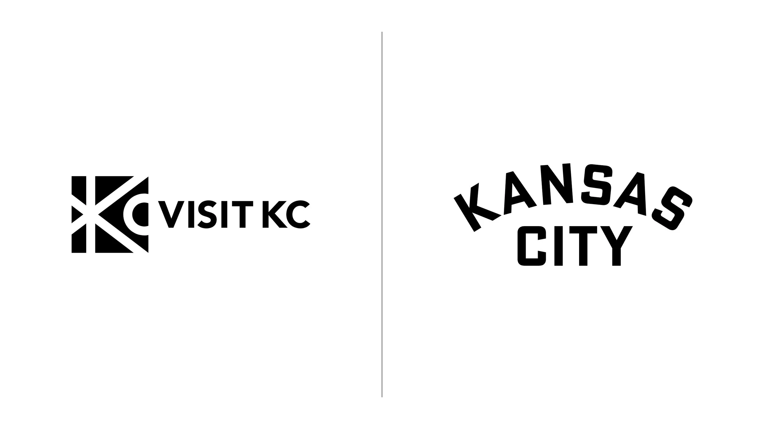
Legacy logo on the left, campaign logo on the right
Color was the other unlock. I evolved their core blues, ditched the cold grays and muddy accents, and introduced a warm cream as the primary neutral. Fresher, friendlier, and way more aligned with how they actually wanted to show up.

Legacy colors on the left, refreshed colors on the right
A secondary palette was explored to compliment the primary colors, either to be used as category labels or for seasonality color changes. The client decided against including these colors for now, but remains open to the idea for future work.

Hundreds of pages, zero template fatigue
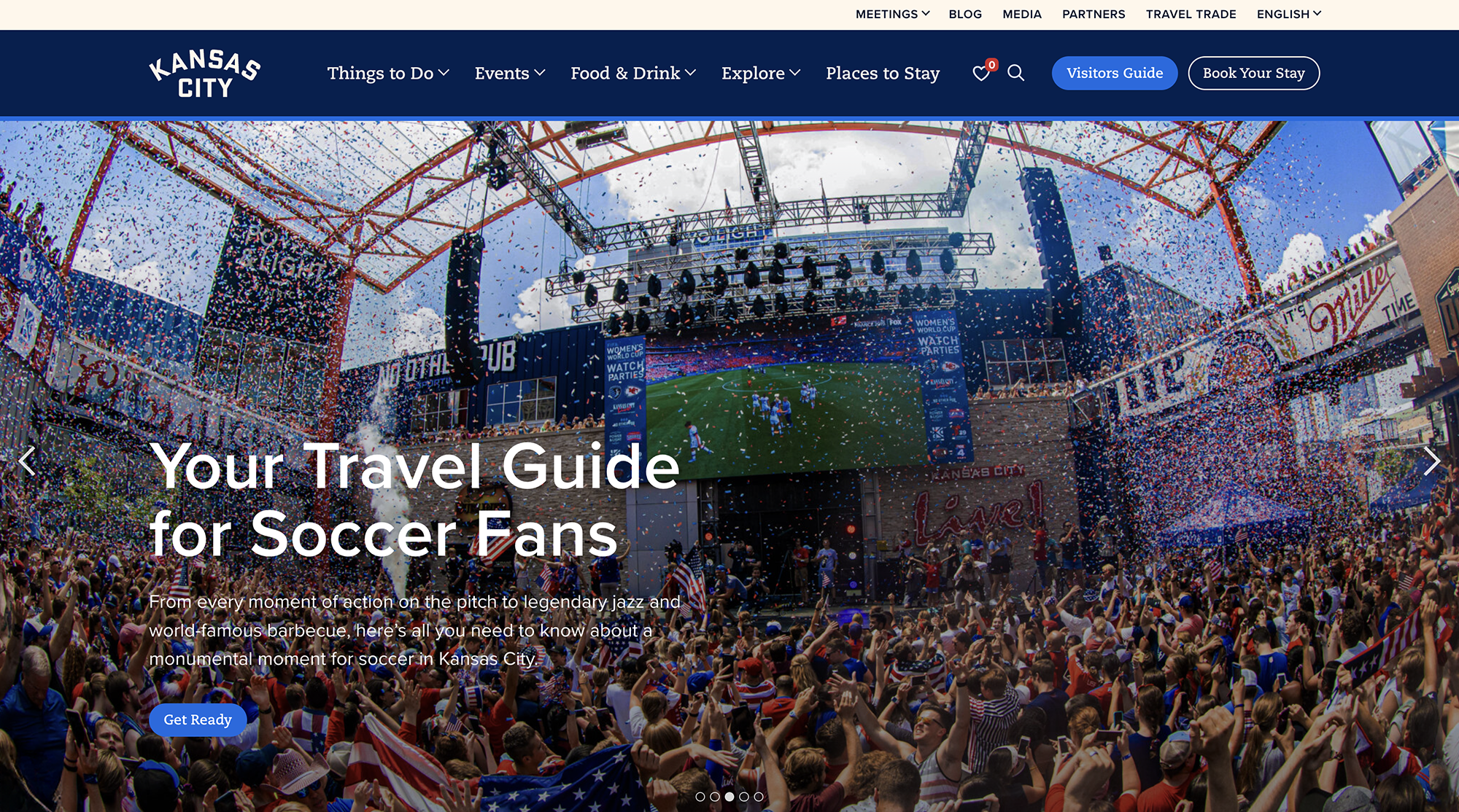
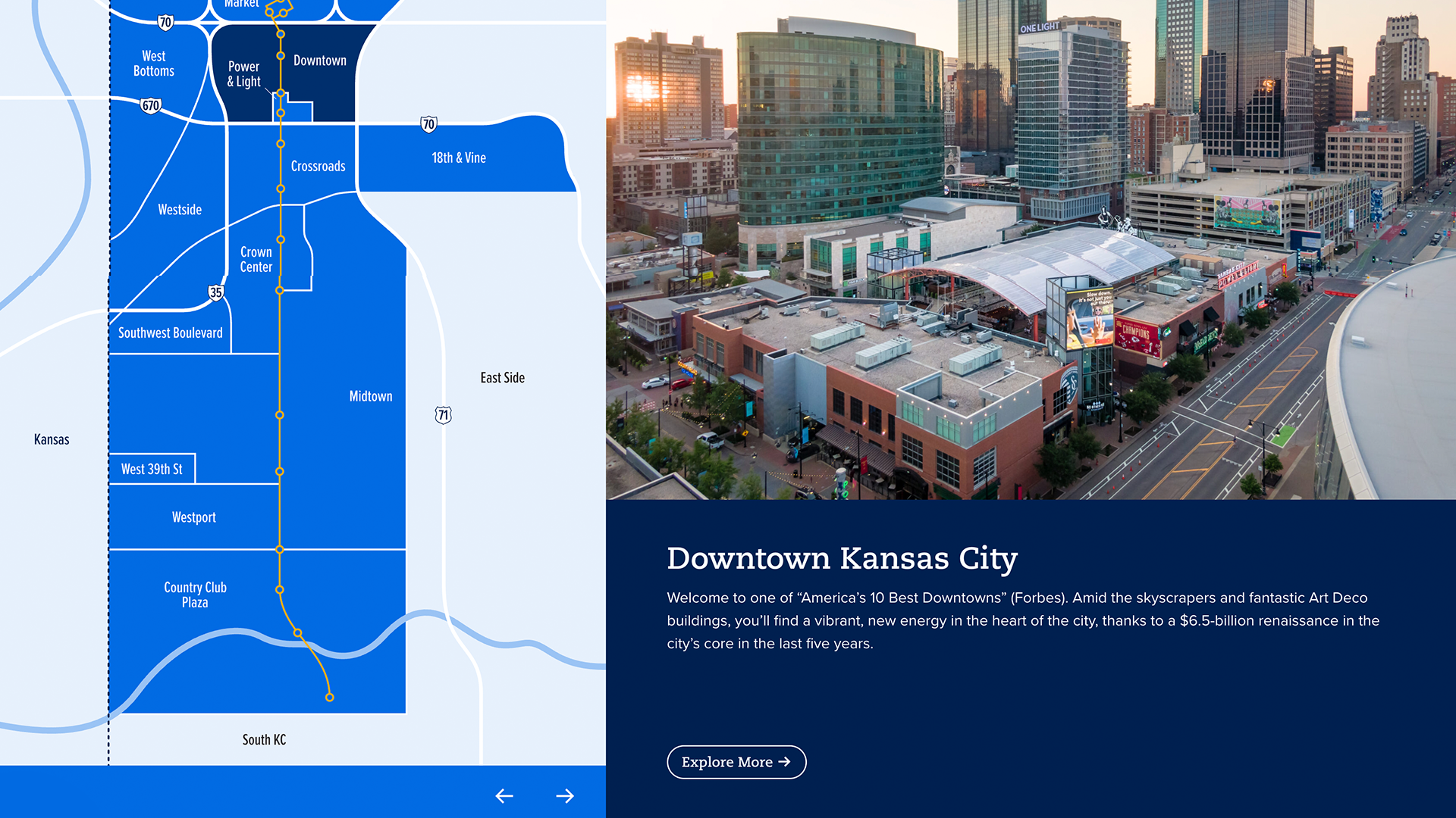
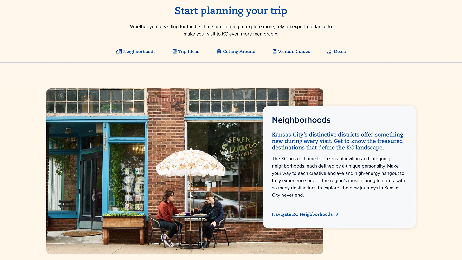
This wasn't a 5-page brochure site. Hundreds of pages—events, businesses, articles, neighborhoods, seasonal content—all needing to feel cohesive without looking cookie-cutter.
I designed nearly two dozen unique page templates, working closely with our SEO and strategy team to clean up navigation and content hierarchy. Mobile-first was non-negotiable since most visitors were planning trips on their phones.
Visit KC has an incredible photo library, so I let imagery lead. Bold navigation grids, modular cards for events and businesses, full-bleed photography wherever possible. The site needed to feel as vibrant as the city itself.


Key features:
Dynamic event and business directories with filtering
Interactive maps to explore by interest and neighborhood
Itinerary builder that moves people from browsing to planning
Localization for international travelers (FIFA World Cup prep)
Flexible microsite templates for major events and campaigns
The backend was just as important. We built a flexible CMS that lets their team update content, create new microsites, and remix modules without needing a developer. Speed matters when you're promoting events and responding to travel trends.
A small detail that matters
The KC heart—a decades-old symbol you'll see on bumper stickers, murals, and basically everywhere in Kansas City—became our signature touch. We used it as the "favorites" icon and tucked it into the footer as a quiet sign-off on every page.
Little things like this make a site feel lived-in, not just designed.

The result
The website won a Silver W3 Award for Website Design in 2025. And within the first two months after launch:
47% increase in partner referrals
14% increase in pages per session
1.73% increase in page views
People are exploring more content and actually engaging with the brand story. Local businesses are getting significantly more visibility and referrals. And the flexible system positions Visit KC to adapt quickly for the World Cup, changing traveler behaviors, and AI-driven search.
"What impressed me most about [the team] was how deeply they immersed themselves in our organization and destination. They didn't just check a box—they spent three days in Kansas City meeting with our team and partners, touring the city and really getting to know what makes KC unique. That level of effort gave them the insight to capture the essence of our brand and deliver a website that feels authentic to who we are. The end result exceeded our expectations."
— Lee Prutsman, Senior Marketing Manager, Visit KC
The site went from "functional but frustrating" to something people actually enjoy using—which for a tourism site is kind of the whole point. If you’re in the need of a weekend getaway, you should definitely check out Kansas City.