
Bringing structure to Sharingbox’s expanding toolbox
About the project
During my final year and a half at Sharingbox, I partnered with our HQ team in Brussels on a global rebrand. While an external agency led the core identity, my team contributed foundational design ideas—and took full ownership of a new sub-brand system to unify our growing suite of offerings.
Oversaw brand rollout across five U.S. markets as Head of Design
Developed sub-brand system for internal tools and sales solutions
Built on the visual language of the new global identity
Created a flexible, future-proof design system used across digital and print
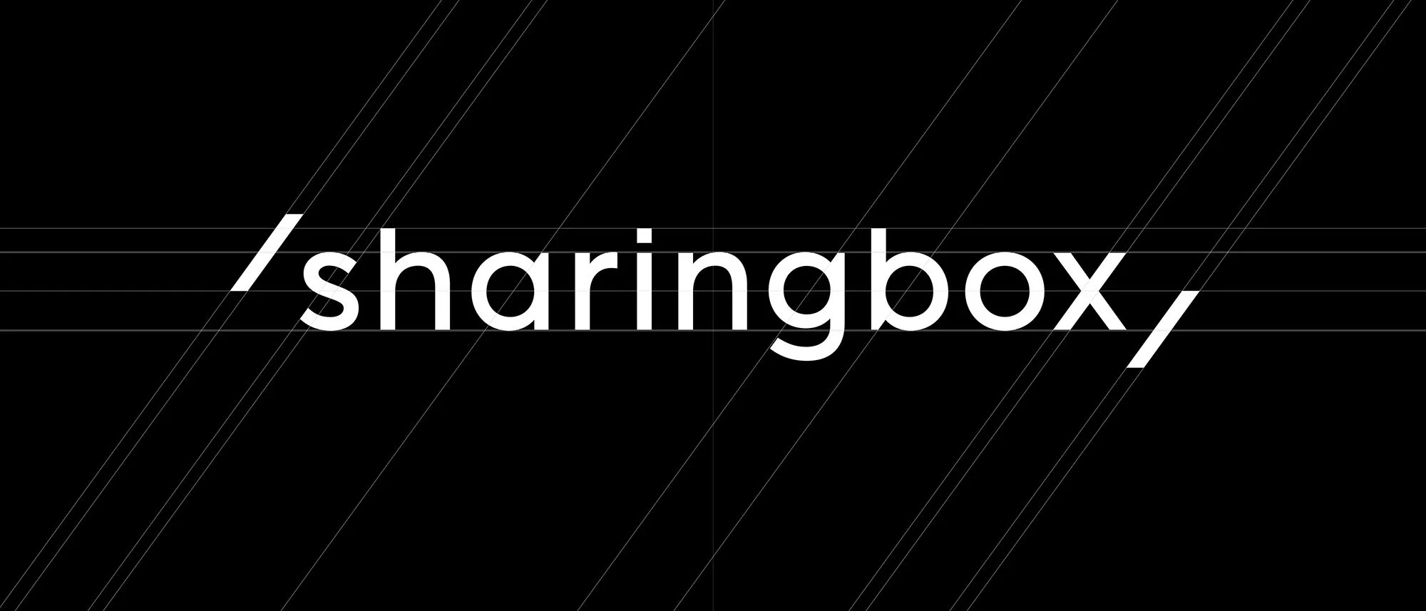
Sharingbox logo construction (agency work)
Design Process
The foundation of the new Sharingbox identity was the “photo frame” slashes—a concept originally developed by my U.S. team and refined by the agency. With that structure in place, we expanded the system to include a set of distinct, ownable sub-brands.
Each sub-brand started with a custom icon, all built to a shared grid with consistent sizing and proportions. The subtle gradient used in the parent brand became our benchmark—informing a series of bold, vibrant gradients that gave each sub-brand a visual identity of its own.
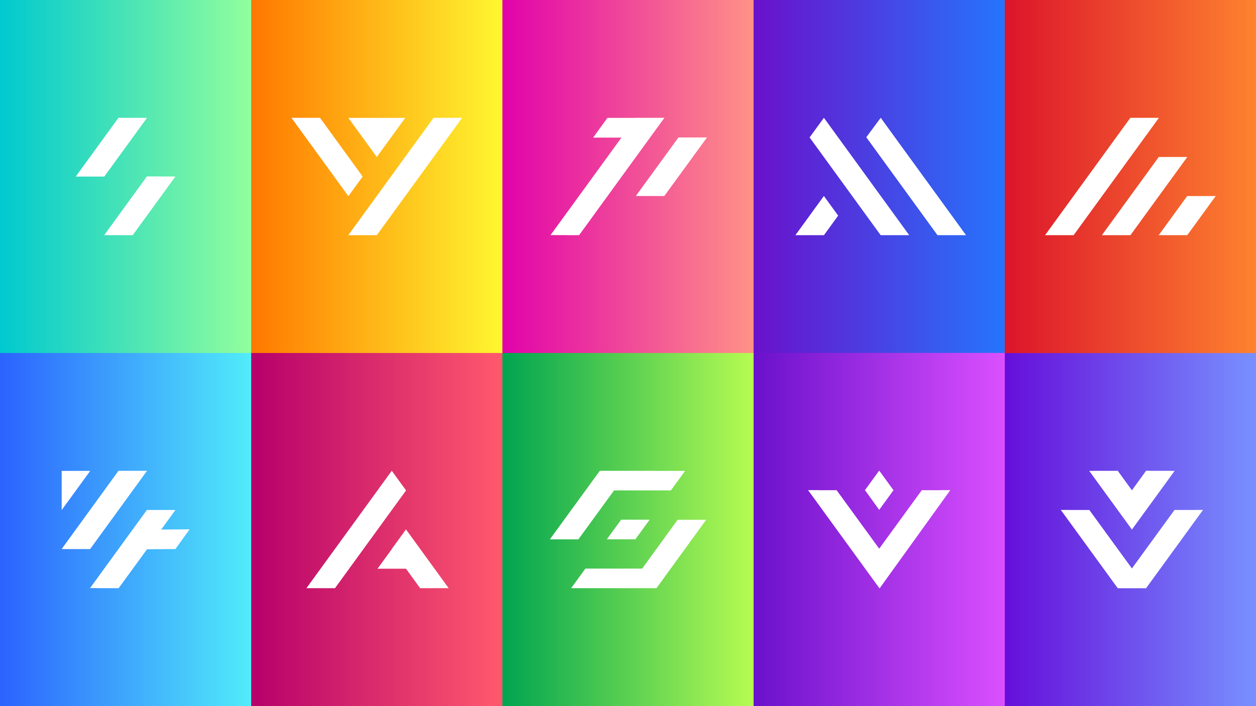
Sub-brand icons and gradients
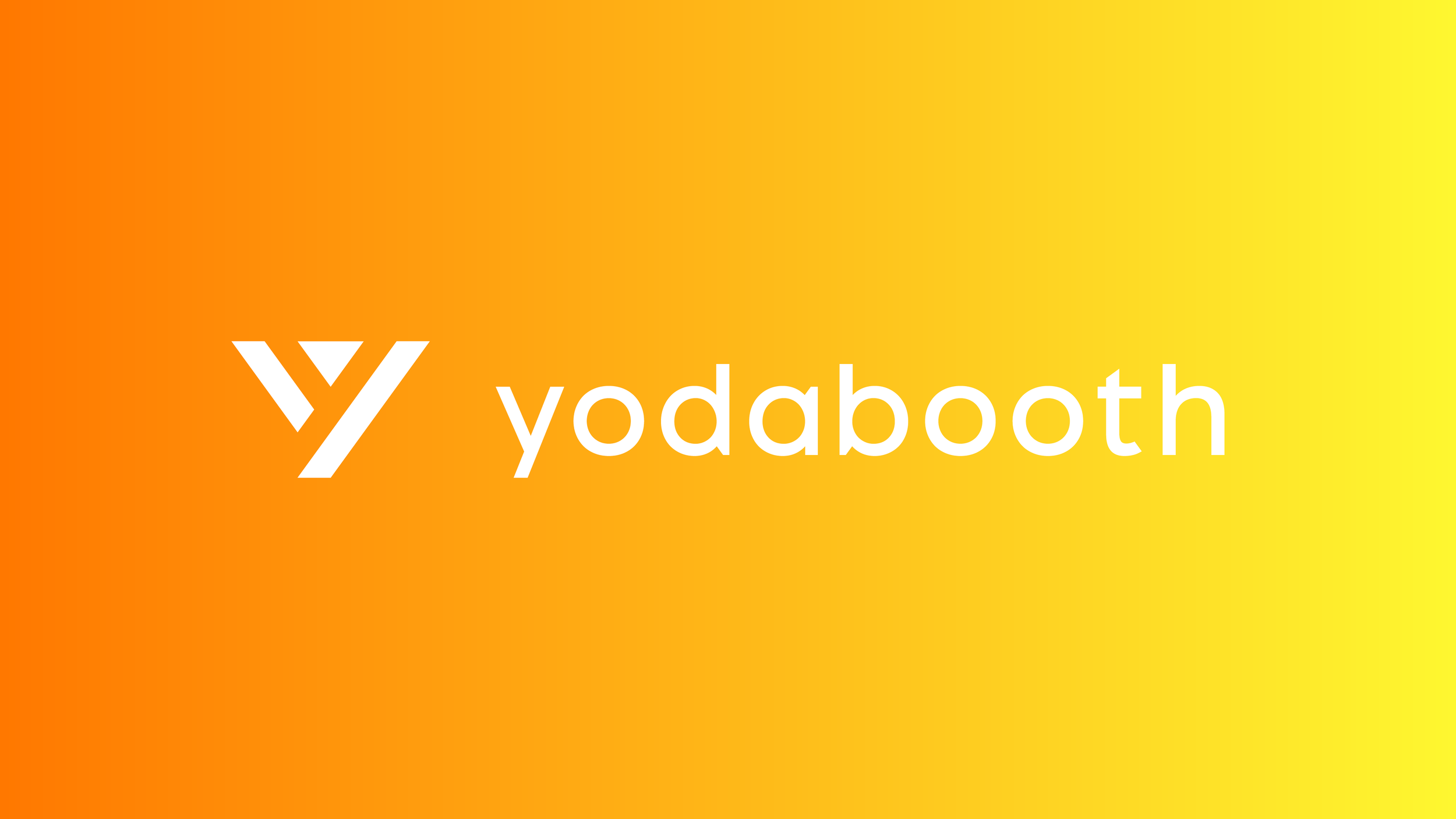
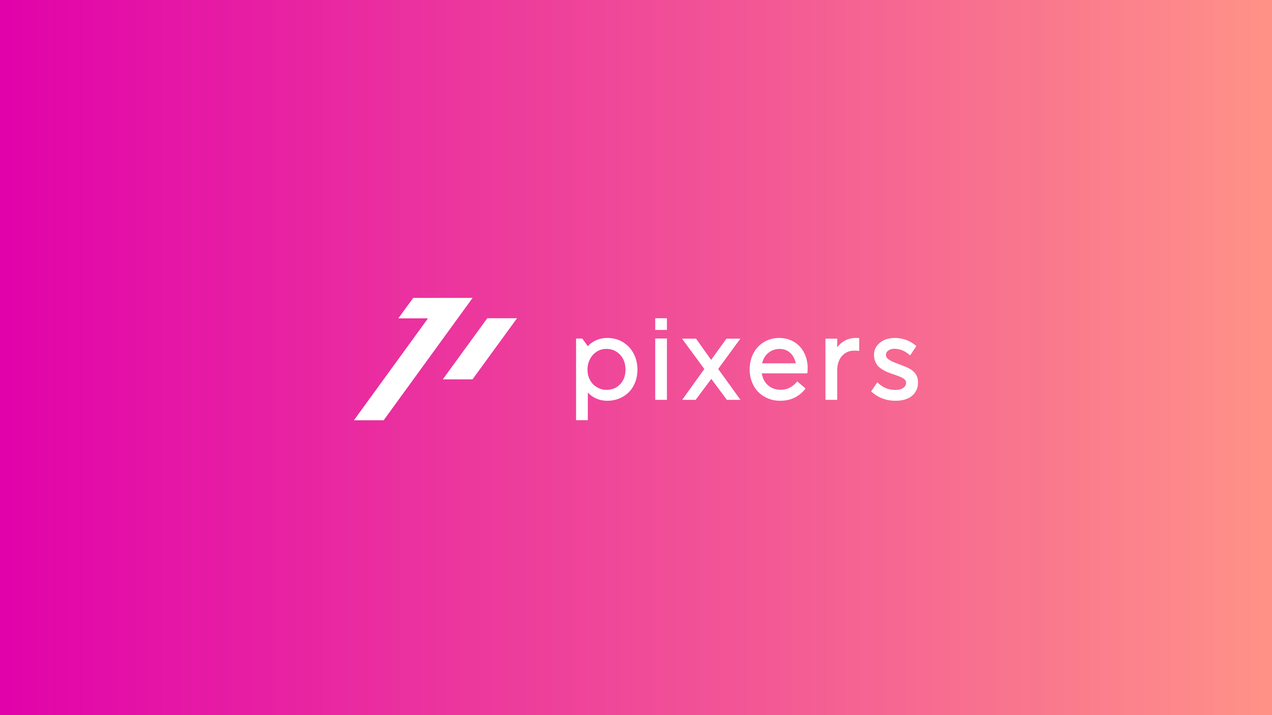
To accompany the icons, I designed a set of logotypes using the same font, weight, and tracking as the primary brand. We paid close attention to nuanced details—modifying letterforms (like cut stems and legs) to maintain consistency across the system.
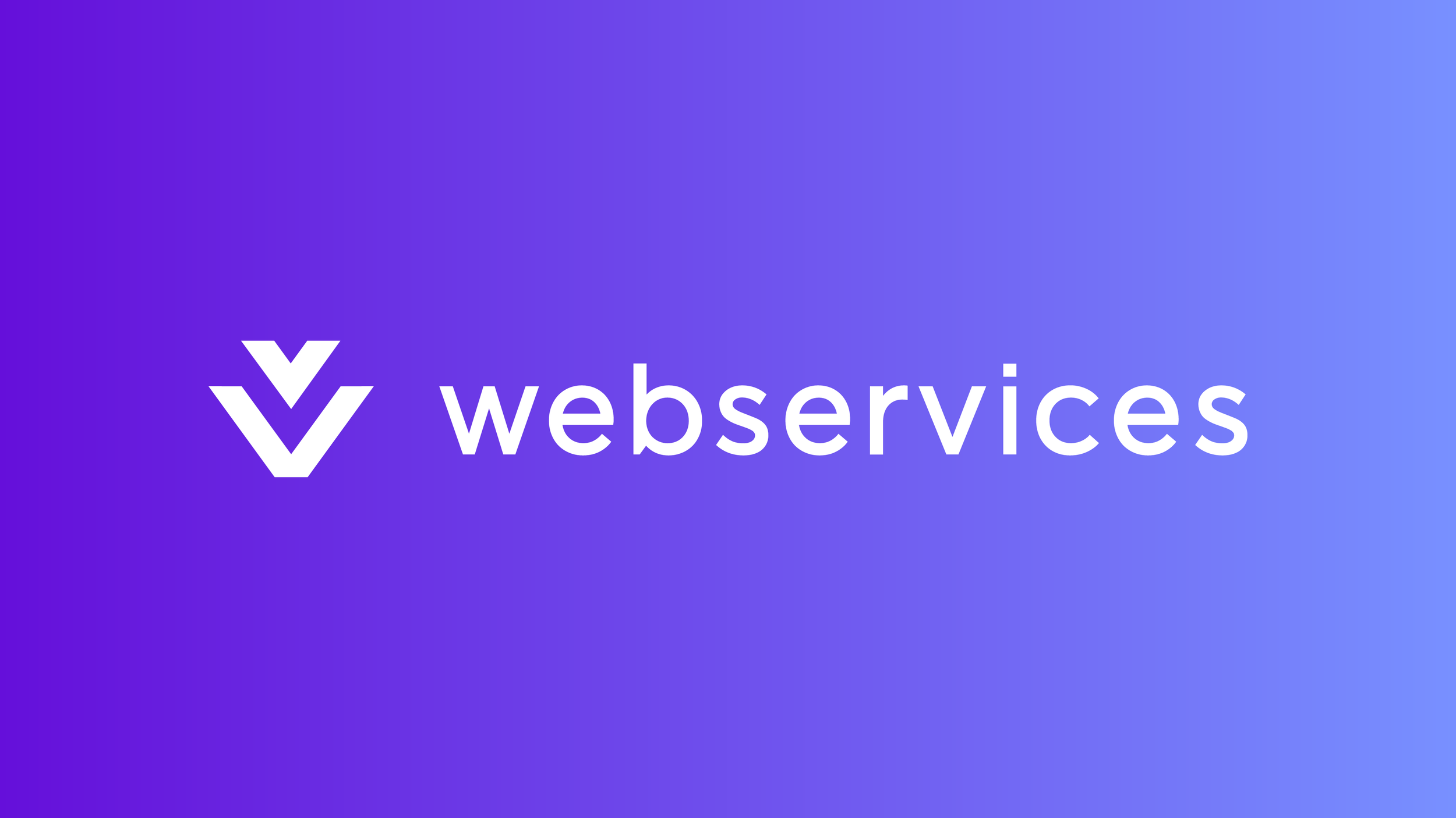
Software & tools
Datalock, Webservices, V4 Software, Arno
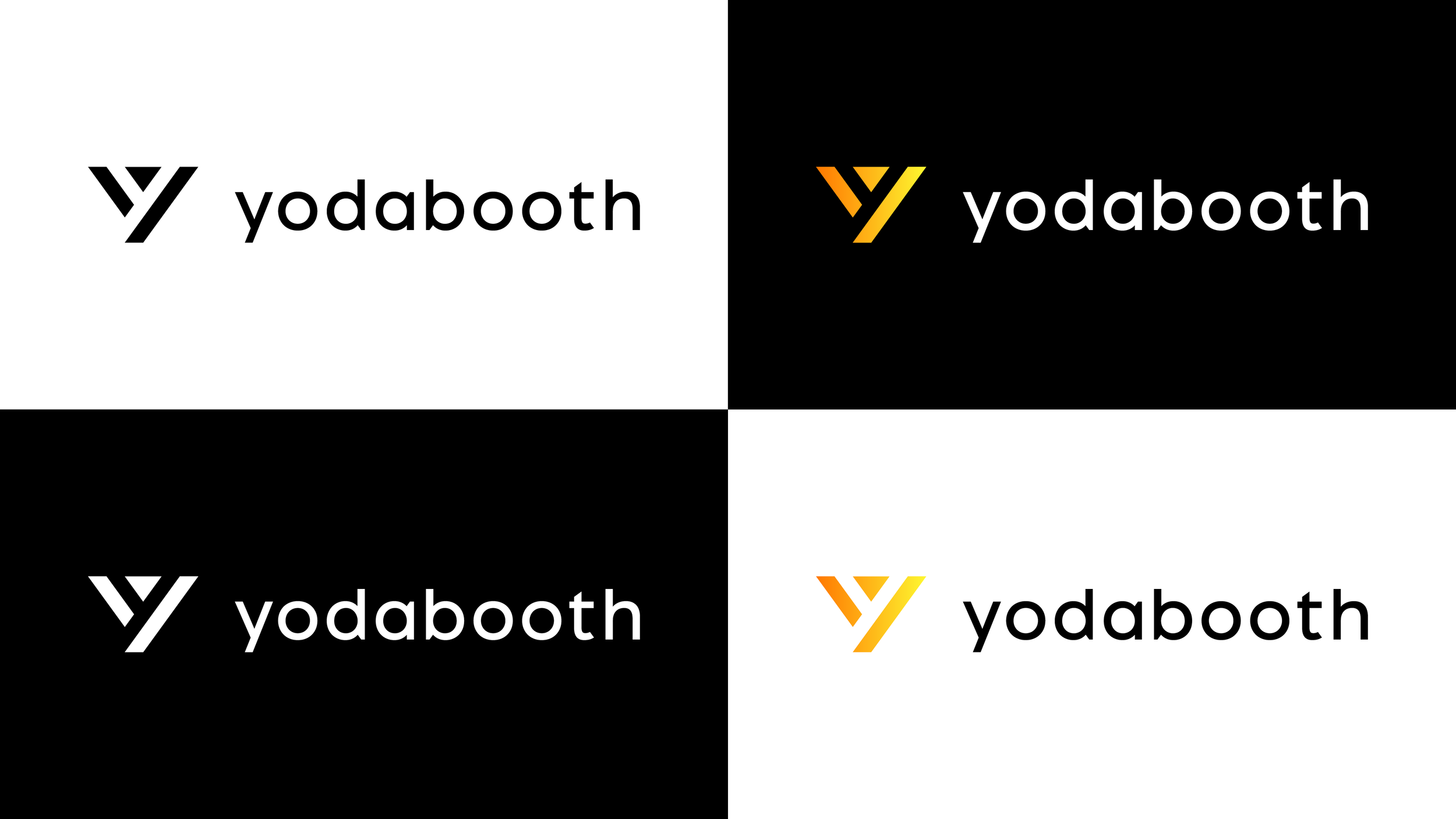
Booth experiences
Yodabooth, Pixers, Mosaic,. Scan+Capture, Media


The full identity was codified in a detailed brand book, which included logo treatments in multiple colorways: primary (gradient icon + black or white wordmark) and secondary (solid black or white).
Example of the four lockup options for each sub-brand

Example of the grid system developed for the sub-brands
Outcomes and Impact
The sub-brand system gave Sharingbox a way to unify and elevate its growing portfolio of tools—without losing sight of the parent brand. It brought visual consistency to marketing, sales, and internal communications across five global markets.
This work not only clarified the company’s product ecosystem but also ensured long-term scalability for future offerings. For a company with rapid growth and shifting services, this system provided a strong, flexible foundation.