
Advocacy that doesn't wait for permission
The challenge
The Black Trans Advocacy Coalition (BTAC) is a grassroots organization fighting for Black trans lives through direct action, mutual aid, and policy advocacy. They needed a brand identity that could match the urgency and power of their work—something bold, unapologetic, and built to mobilize.
The existing visual identity wasn't doing them justice. It felt scattered, lacked cohesion, and didn't reflect the strength of the community they represent. They needed a complete rebrand that could work across organizing materials, social media, merchandise, and fundraising campaigns.
What I did:
Full brand identity (logo, color system, typography, guidelines)
Pro bono work, completed solo over a few weeks
The brand identity
BTAC's work is rooted in resistance, resilience, and community power. The brand needed to reflect that—no corporate polish, no watering down the message. This identity was built to be loud, proud, and impossible to ignore.
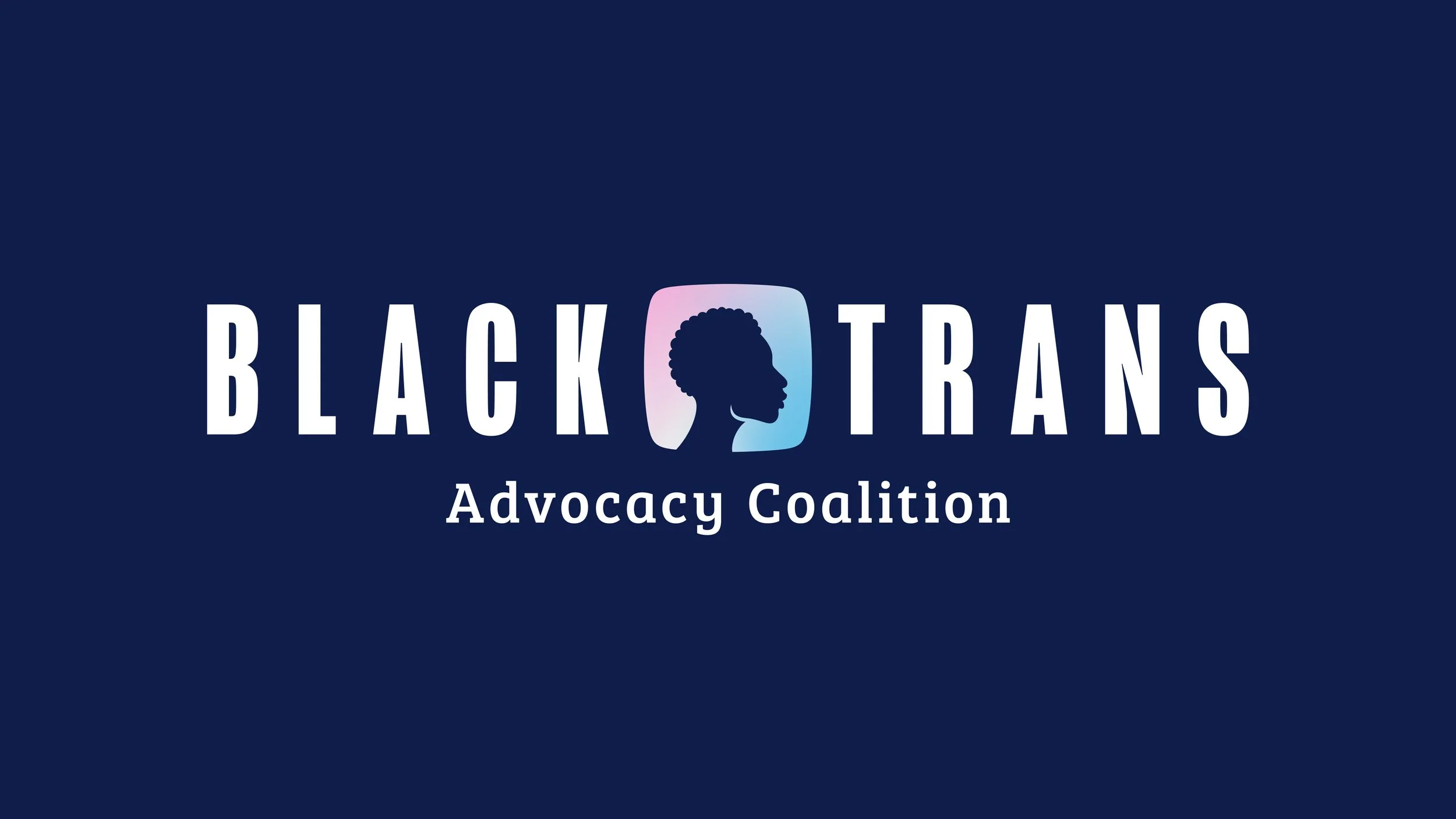
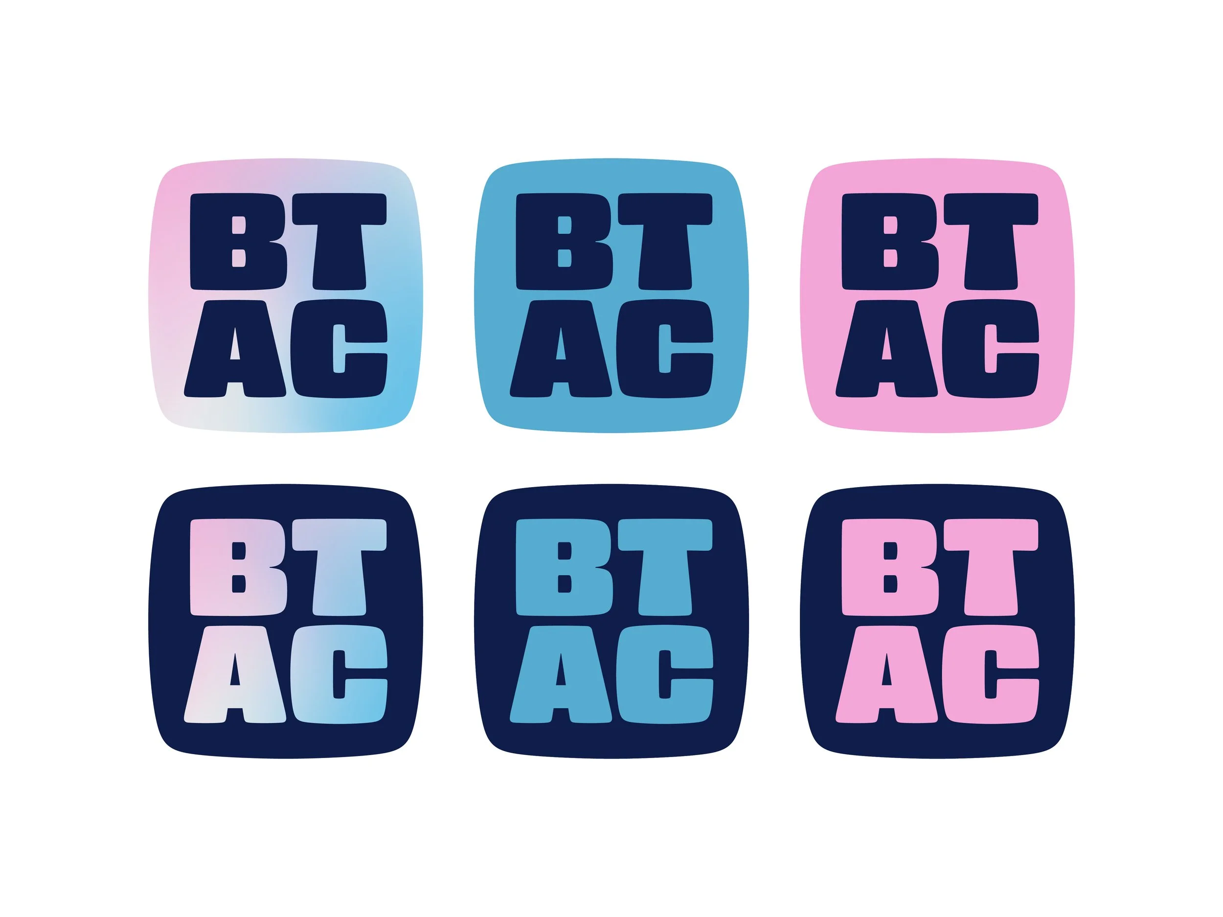
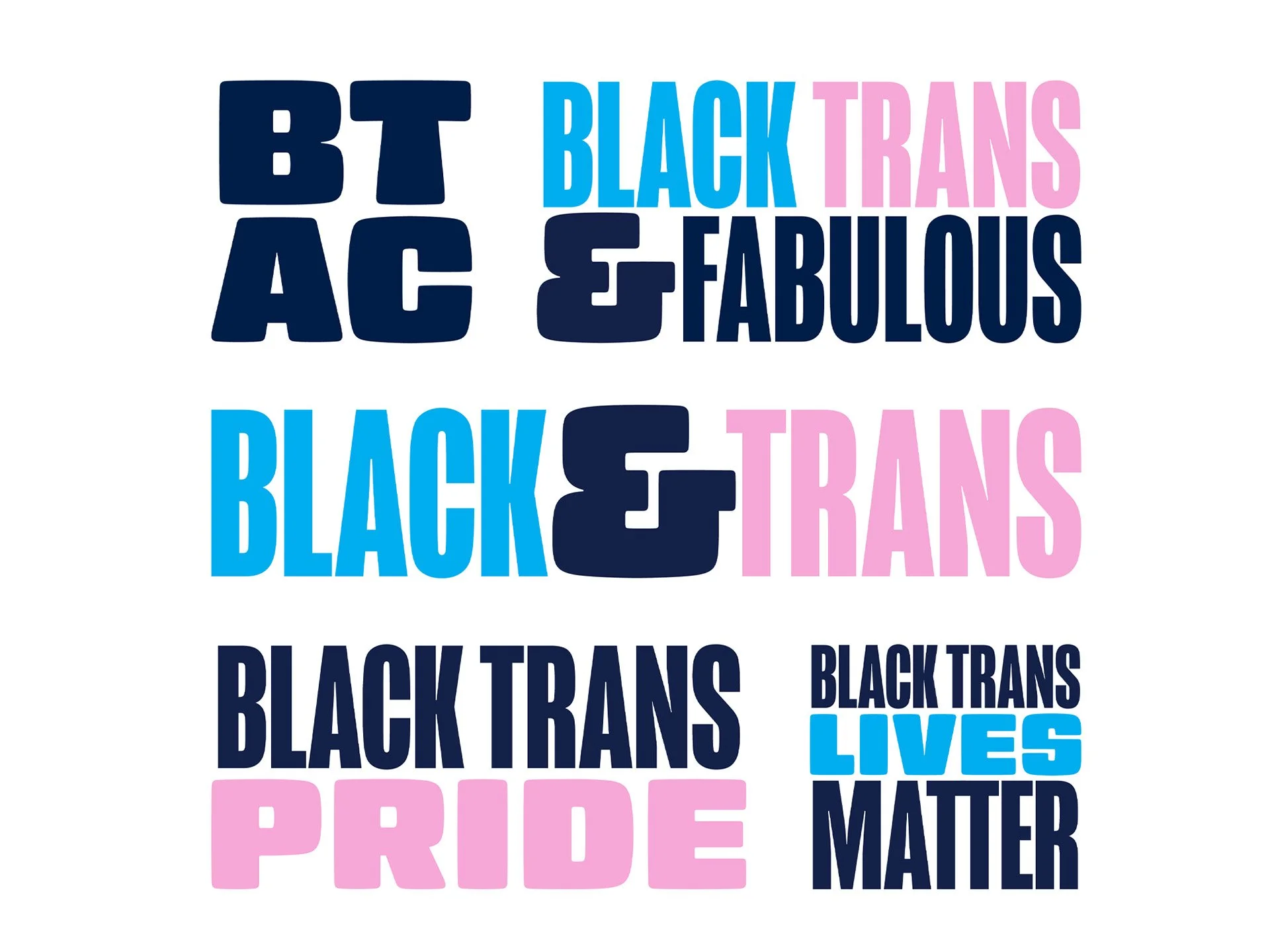
The wordmark is bold and geometric, with strong horizontals that give it weight and presence. It's built to work at any size—on protest signs, social media graphics, or printed zines. The design feels modern but grounded, confident but not corporate.
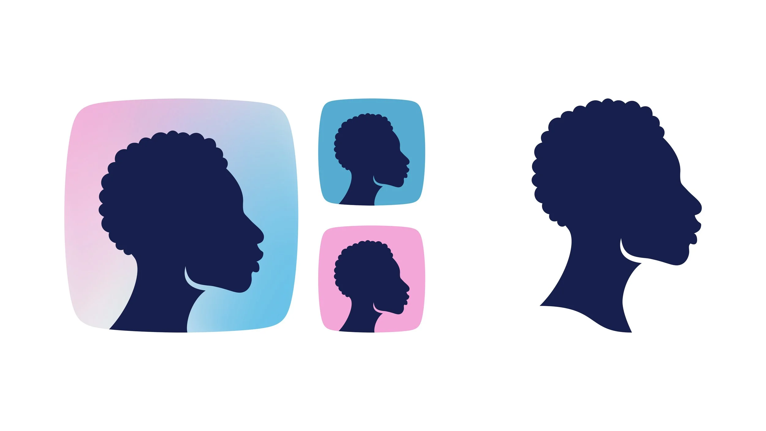
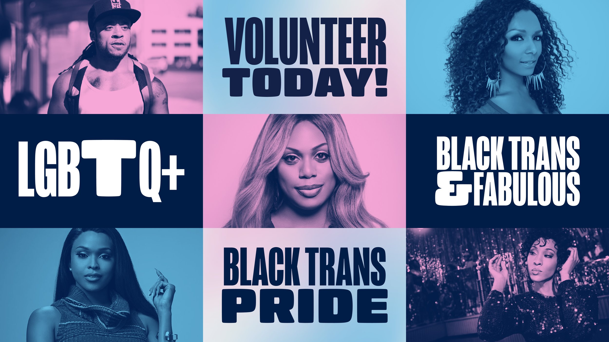
The profile icon was a delightful challenge. I wanted to create a profile as a nod to their current logo, one that felt recognizably black without leaning towards either gender binary.
The profile icon was a delightful challenge. I wanted to create a profile as a nod to their current logo, one that felt recognizably black without leaning towards either gender binary.
The palette centers Black trans identity and pride. Light blues and pinks reference the trans flag, while navy blue anchors the design in strength and solidarity. The system is vibrant, unapologetic, and built to stand out.
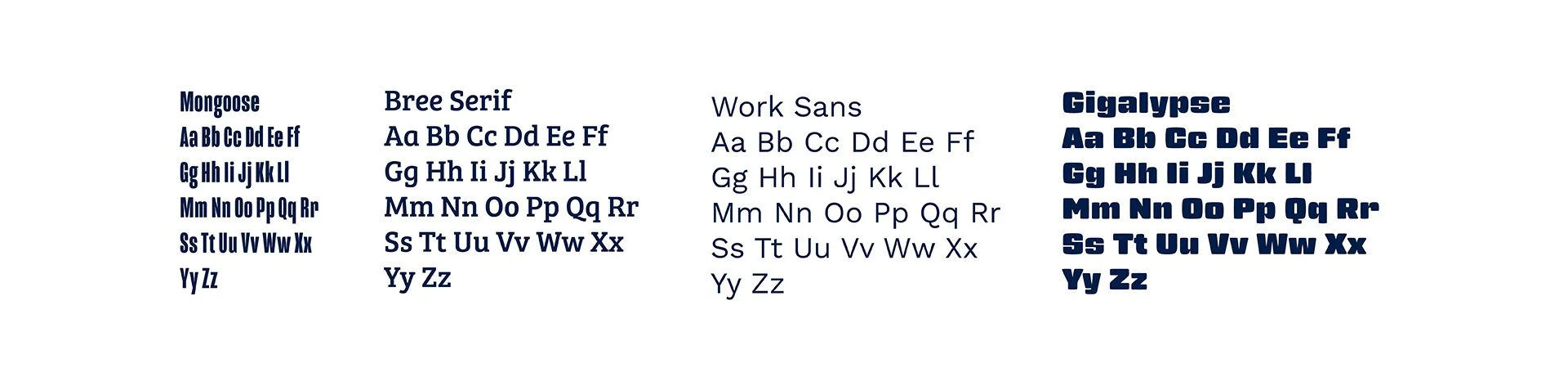
The typography is intentionally varied and flexible, designed to be interchangeable for social media, web, and motion work.
The result
The rebrand was completed in early 2020, but the project was paused due to the pandemic and ultimately never launched. BTAC shifted focus to mutual aid and emergency response work as COVID-19 hit Black trans communities especially hard.
While the identity didn't go live, the work itself demonstrates how design can amplify grassroots movements. The brand was built to mobilize, to communicate urgency, and to center the voices of Black trans people without apology. Sometimes the most important design work is pro bono. And sometimes it doesn't make it to market. But the intent—and the craft—still matter.