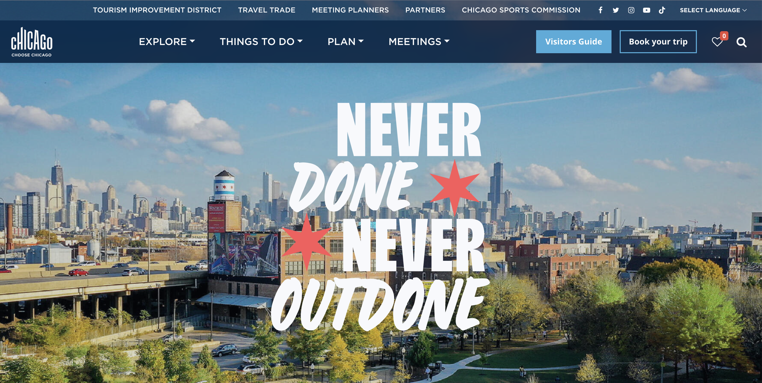
Building the brand behind Chicago's “Never Outdone”
The Challenge
Choose Chicago, the city's official tourism marketing org, needed a campaign that could hold its own against every other city's "come visit us" ad. Chicago had the goods — world-class food, music, architecture, neighborhoods that don't quit — but no single line that captured the chip on its shoulder. The kind of thing a Chicagoan would actually say out loud.
The brief: build a platform that felt like the city, not like tourism marketing. Something that could flex across a launch campaign, OOH, social, and a redesigned landing page, and hold up season after season without going stale.
What I Did
Helped lead brand and creative direction alongside the Envisionit team
Developed the color palette and visual identity system
Explored new logo and wordmark directions
Storyboarded the anthem spot and its cutdowns, script beat by script beat
Worked across concept development, three rounds of audience testing, and seasonal creative extensions
Starting with Chicago's own storytellers
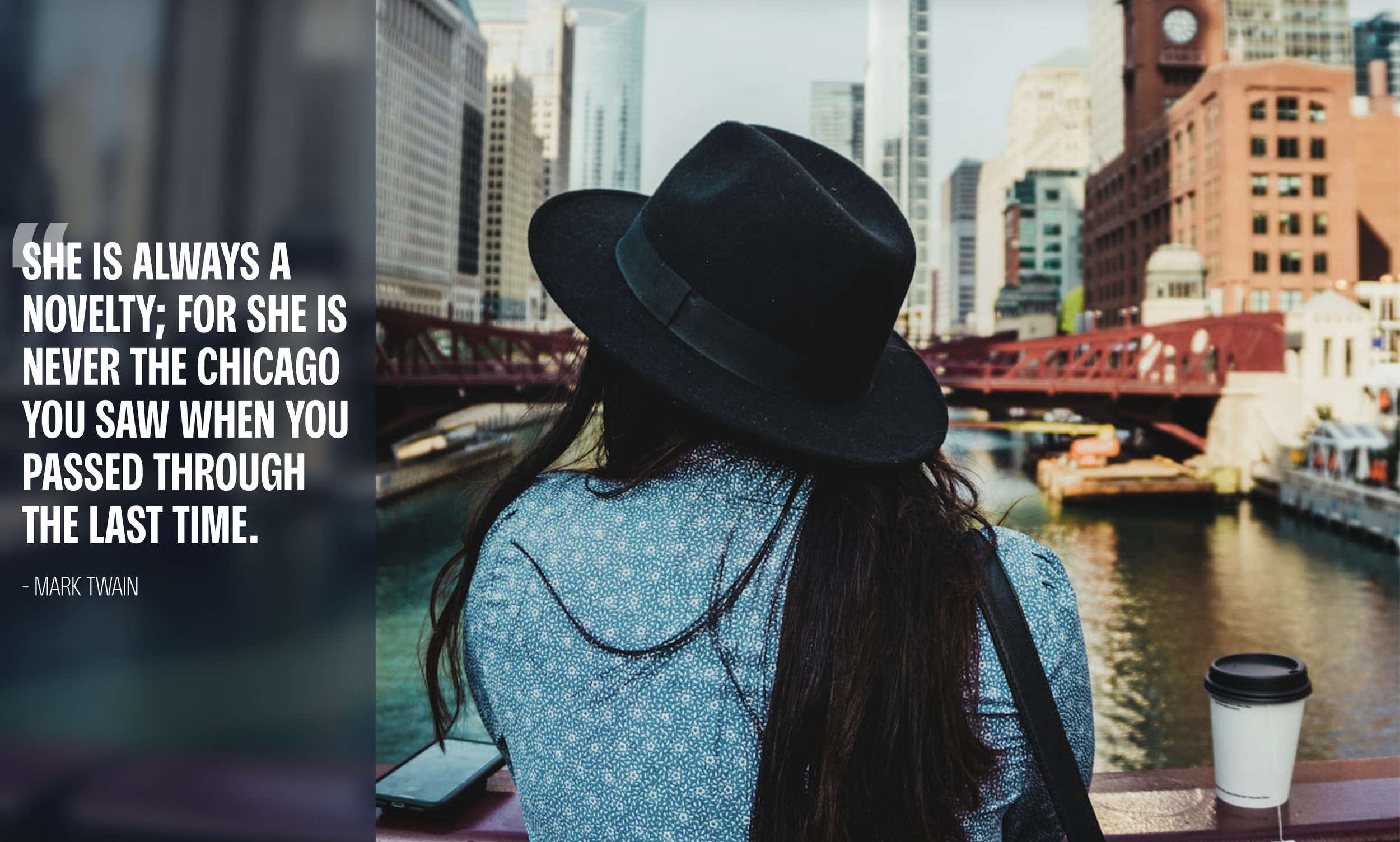
The idea we pitched: stop telling people about Chicago and let Chicagoans tell it themselves. We built the concept around a script that owed a debt to Carl Sandburg's "Chicago" — hog butcher and wheat stacker, reworked into "legend maker and curse breaker" — read over footage of real bakers, muralists, athletes, and bartenders instead of stock skyline shots.
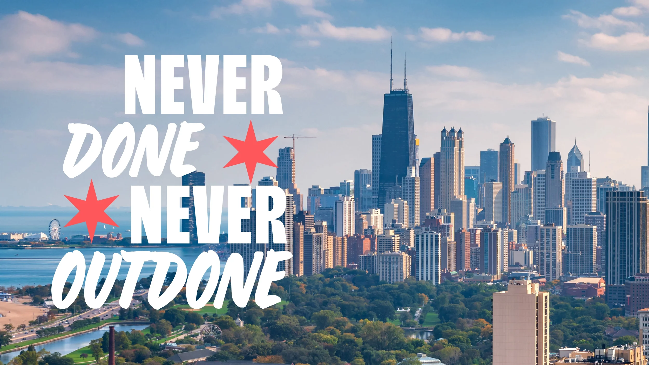
That script gave us the line that became the whole platform: a city that's never done, and never outdone.
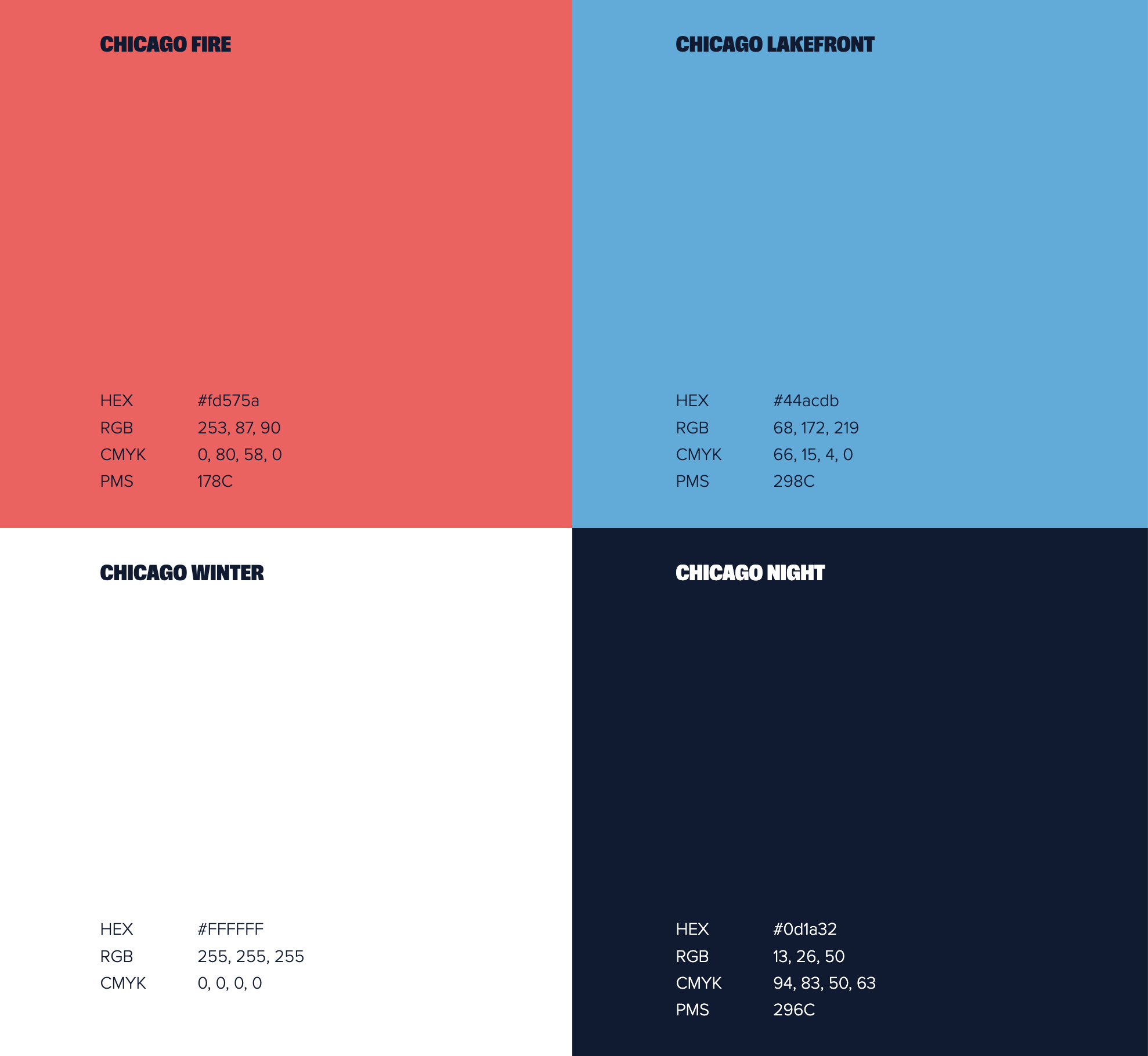
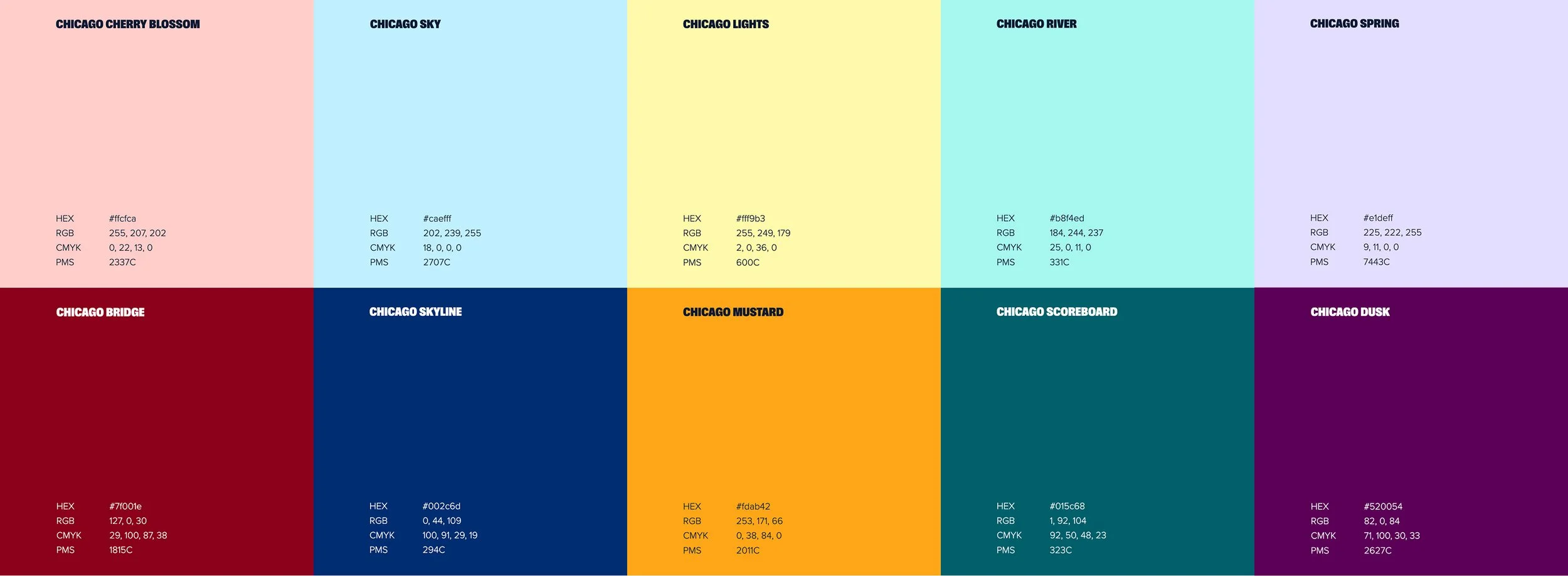
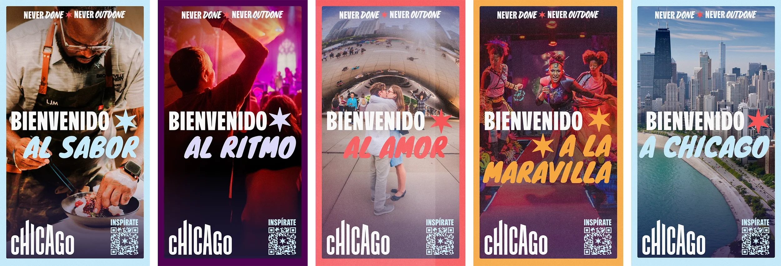
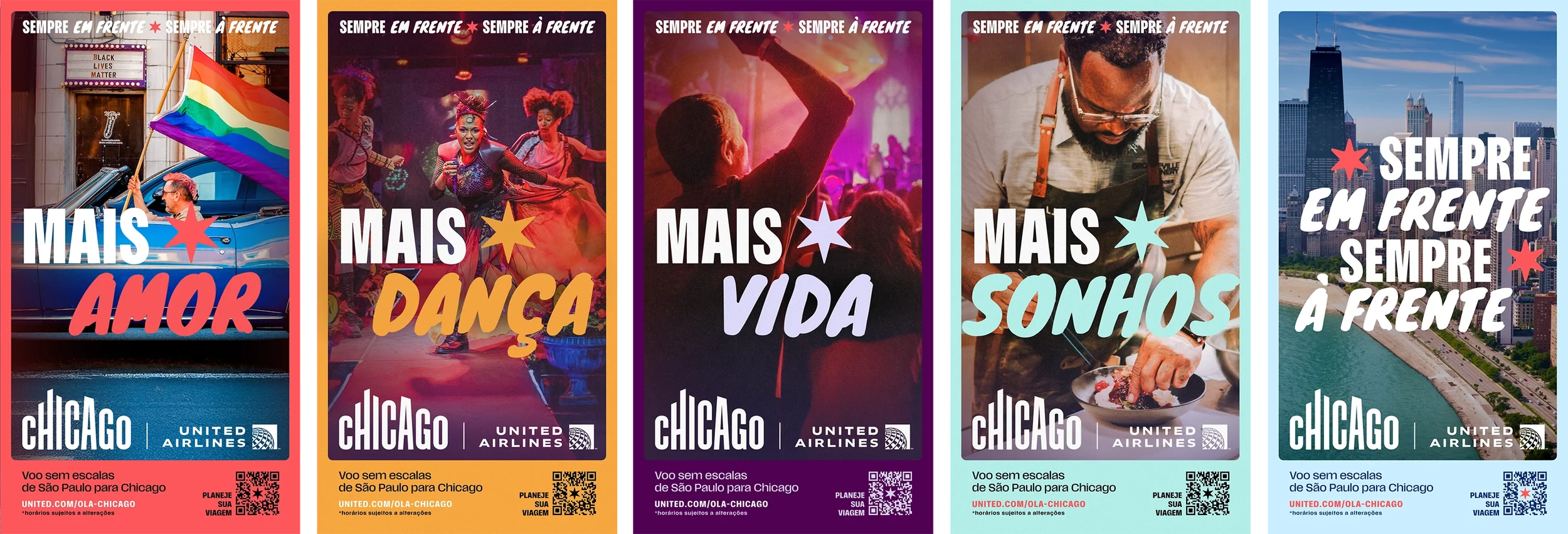
I built out the color system from there: a hot coral red paired against a cooling mint teal, with a wider secondary palette — ochres, greens, indigos, magentas — that could flex across neighborhoods and content categories without the campaign losing its center.
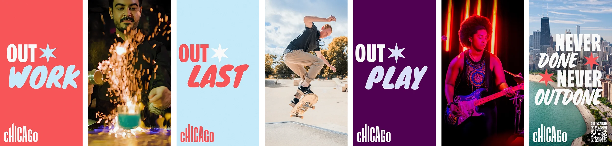
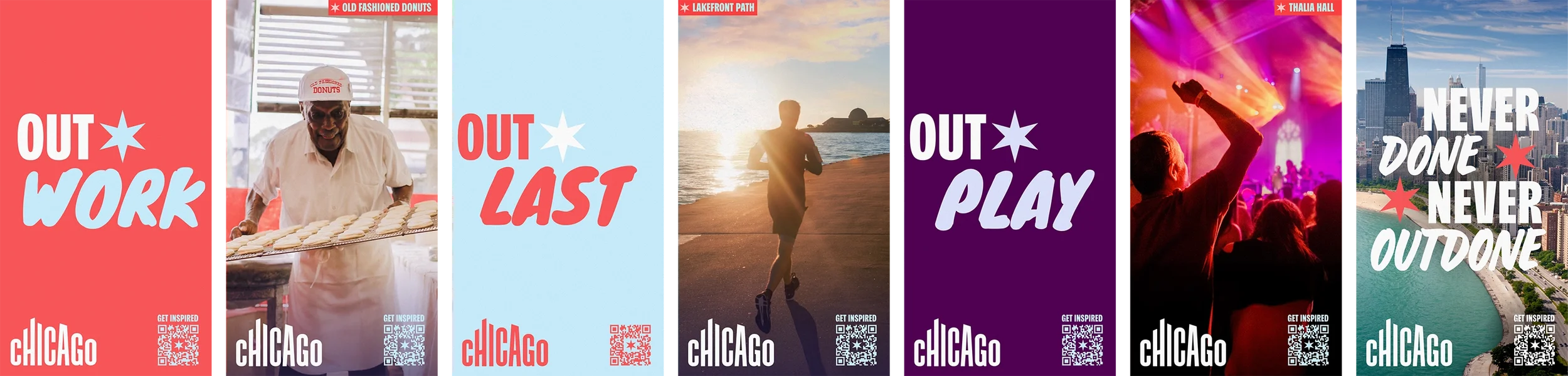
Photography direction leaned hard into candid and photojournalistic over polished, referencing local photographers like Kathleen Hinkel and Clayton Hauck to keep the visual language rooted in Chicago rather than generic destination-ad gloss. Type followed the same brief: Scale Variable, a condensed, slightly rough sans that reads more hand-stamped than corporate.
Storyboards, not the final cut
I storyboarded the anthem spot across every length it needed to run — :60 down to a :06 — pairing each line of the script with a specific visual beat so the production and motion teams had a clear map before a camera ever rolled. Motion design and final edit were handled by other folks on the team; my job ended at the shot list.
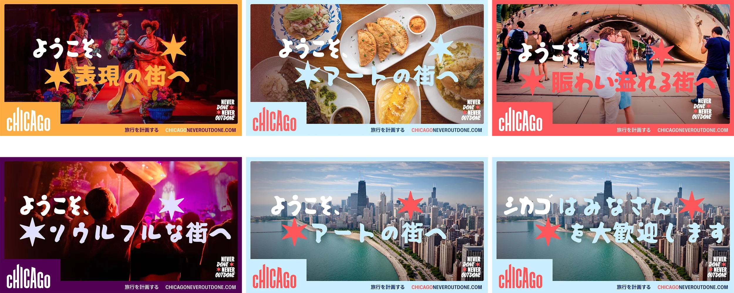
This was an international campaign, so I got to try my hand at designing in a few additional languages, and worked closely with a translation service.
Built to survive contact with real audiences
Before any of this shipped, we put it in front of over 100 people across three rounds of testing — Chicago locals, regional travelers, and folks from New York, LA, Miami, and Atlanta. The feedback was blunt: people liked the energy and the diversity of the casting, but the early tagline-forward work read as generic. Locals in particular wanted less slogan, more specific Chicago — actual neighborhoods, actual people, actual restaurants, not just skyline shots with a line of type over them.
That pushback shaped every round after it. Later creative leaned harder into neighborhood specificity — Pilsen, Bronzeville, Logan Square, Pullman — and real Chicagoans doing the talking instead of a voiceover doing it for them.
The result
"Never Outdone" is live now at choosechicago.com, built around real Chicago voices — street artist Sentrock, pitmaster Chef Dominique Leach, DJ Duane Powell — alongside an "Est. 1837" framing that ties the modern campaign back to the city's founding. The platform's held up well enough to extend twice: a winter 2026 push built around "The Warmest City," and a summer 2026 campaign for cultural travelers and families, both built on the same script-and-storyboard process. There's even a small merch line through T-Shirt Deli carrying the coral, teal, and star treatment forward into actual product.