Tribery
Brand Development | 2019
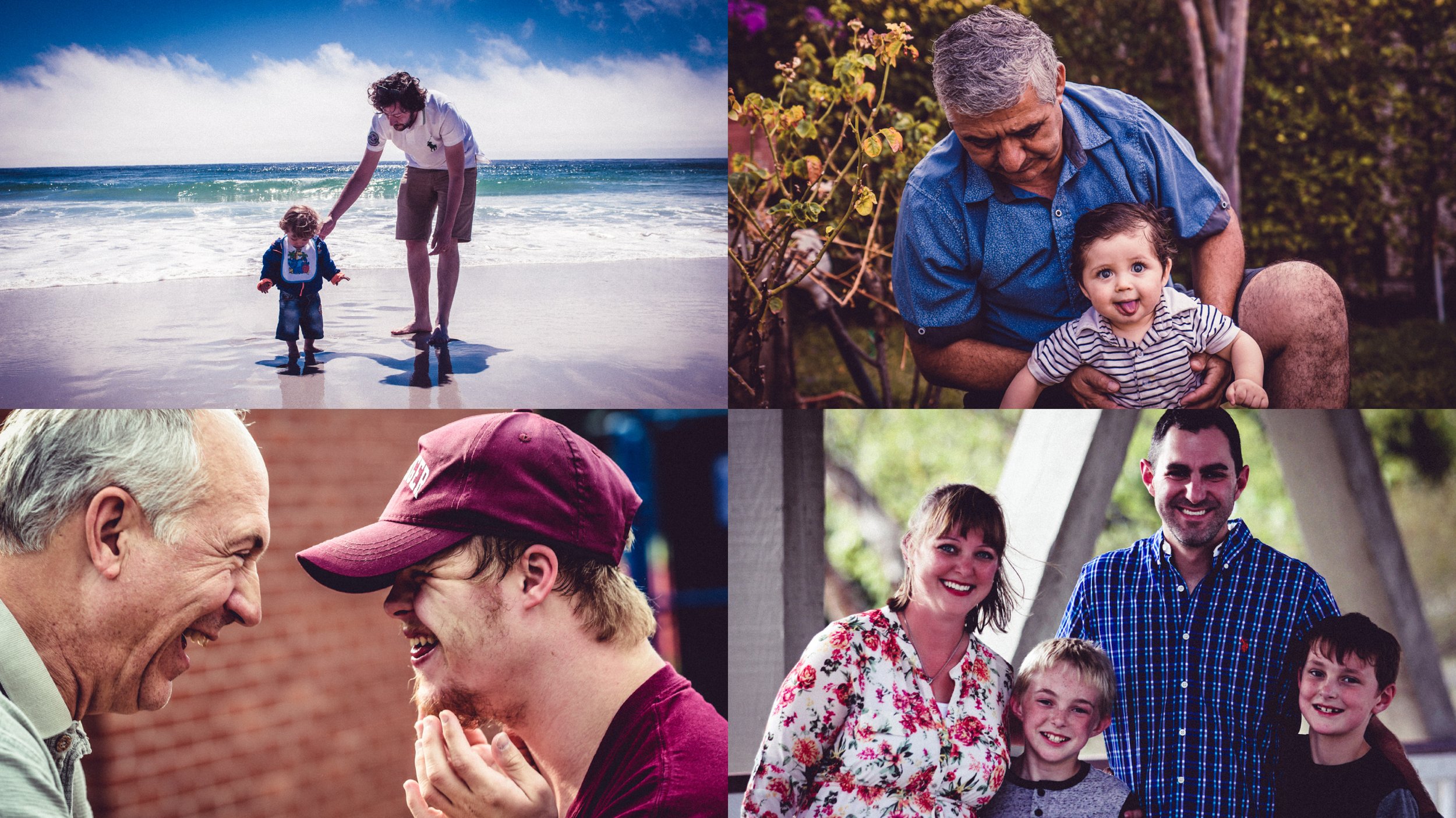
I was approached by a small team looking for an identity creation for a new app. As a response to the ongoing quarantine, Tribery would allow families to upload photos, write captions, and get monthly mini-magazines printed and shipped to relatives and friends who might be missing out on the ongoing life events.
They wanted a brand that would be vibrant, family-friendly, and attention-grabbing on the app store.
Primary logo lockup and color scheme
It was important for them to keep the face of the person from their current branding. I redrew the silhouette to be recognizably black, but live in a gray area between masculine and feminine. They are looking forward with their chin up, peaceful but powerful.
The silhouette forms the centerpiece of the new identity. A flexible logo system was designed around it, with expansions for local and regional groups in the subhead.
White, pink, and light blue—the colors of the trans flag—are matched with a deep navy for contrast and grounding of the identity.
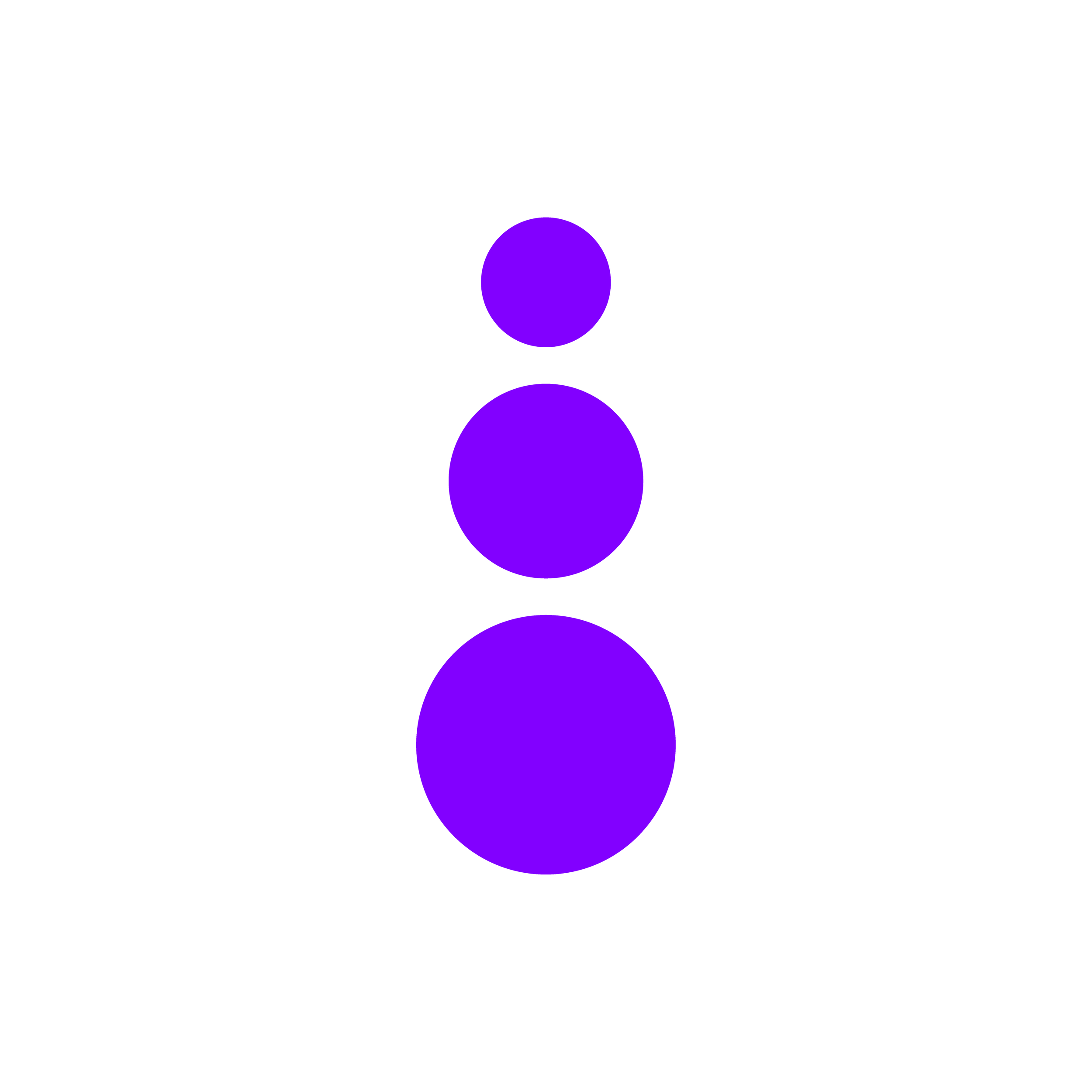
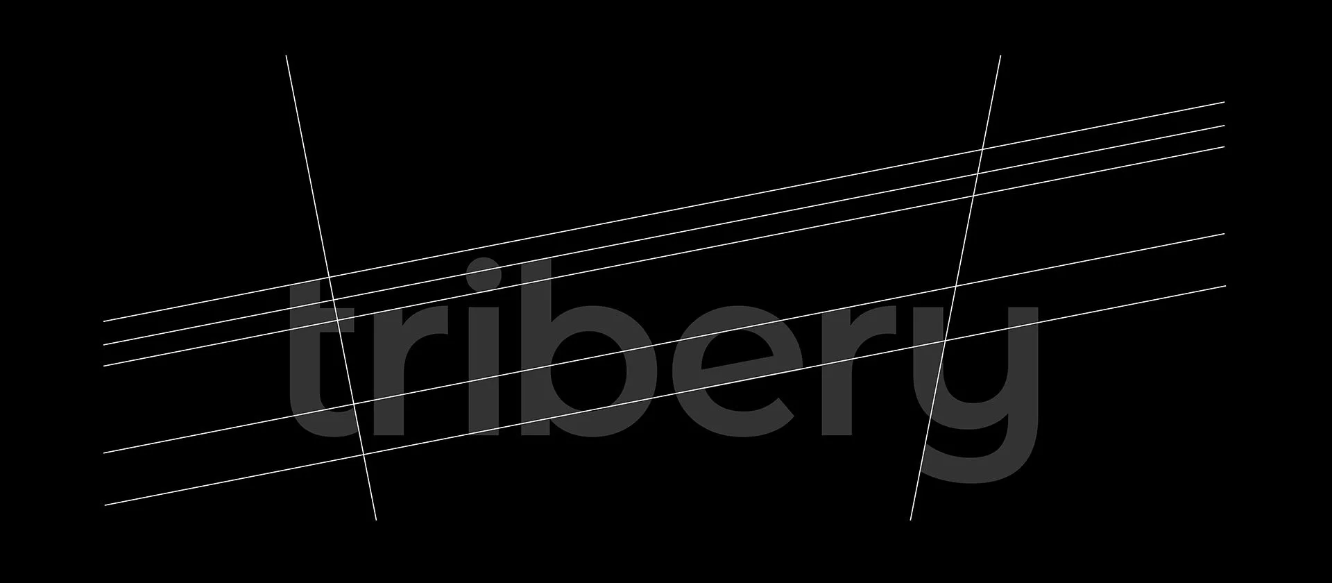
The logo itself is a customized sans-serif with an icon that represents the growth and expansion of families.
The 11° rotation of the "e" is used to customize the rest of the letters, including 90° rotations for the tails of the "t" and the "y."
The icon’s design was specially requested by the client. It represents growth, family, and connectivity.