
A bold new brand for businesses left behind
The Challenge
Pixxles is a payment processing platform built for businesses that traditional providers won't touch. Cannabis dispensaries, adult entertainment, specialized retail, and other underserved industries all need ways to accept payments—but most fintech companies won't work with them.
The existing Pixxles brand was safe, corporate, and forgettable. In a space where trust and differentiation are everything, they were getting lost in the noise. They needed a complete visual overhaul that could make a splash while still feeling credible.
What I Did
Full brand identity refresh (logo, color system, typography, guidelines)
Website design (6 pages before the project ended)
Campaign concept development (partnering with ACD and copywriter)
The brand refresh
We kicked things off with logo and color explorations, aiming for something that felt punchy, modern, and just a little risqué. The client gravitated toward bright neon palettes and a custom “xx” ligature that hinted at their edgier clientele.
I originally favored a simpler pixel-style “P” icon, but found a way to bring that same retro energy into a more dynamic mark that balanced client preferences with usability.


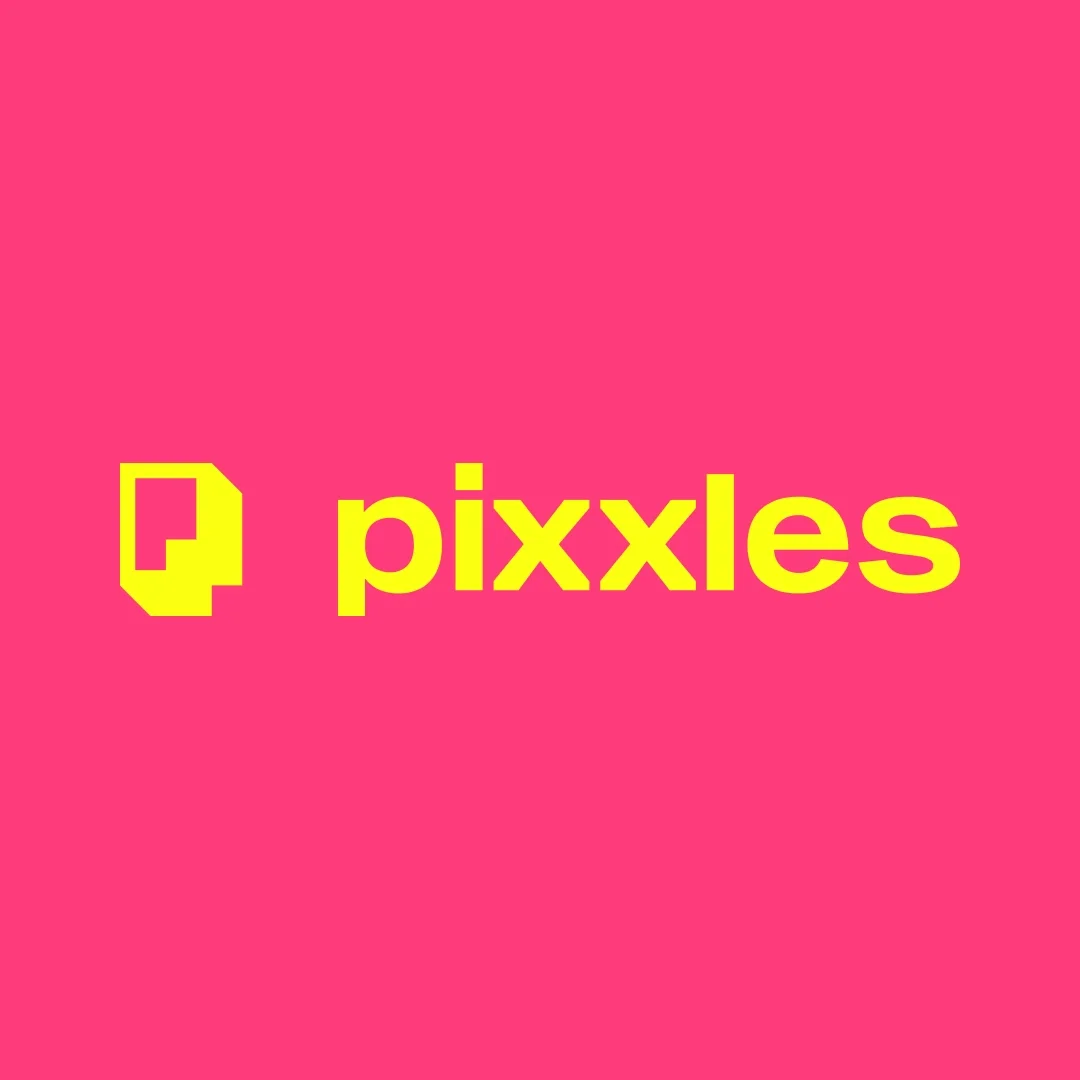
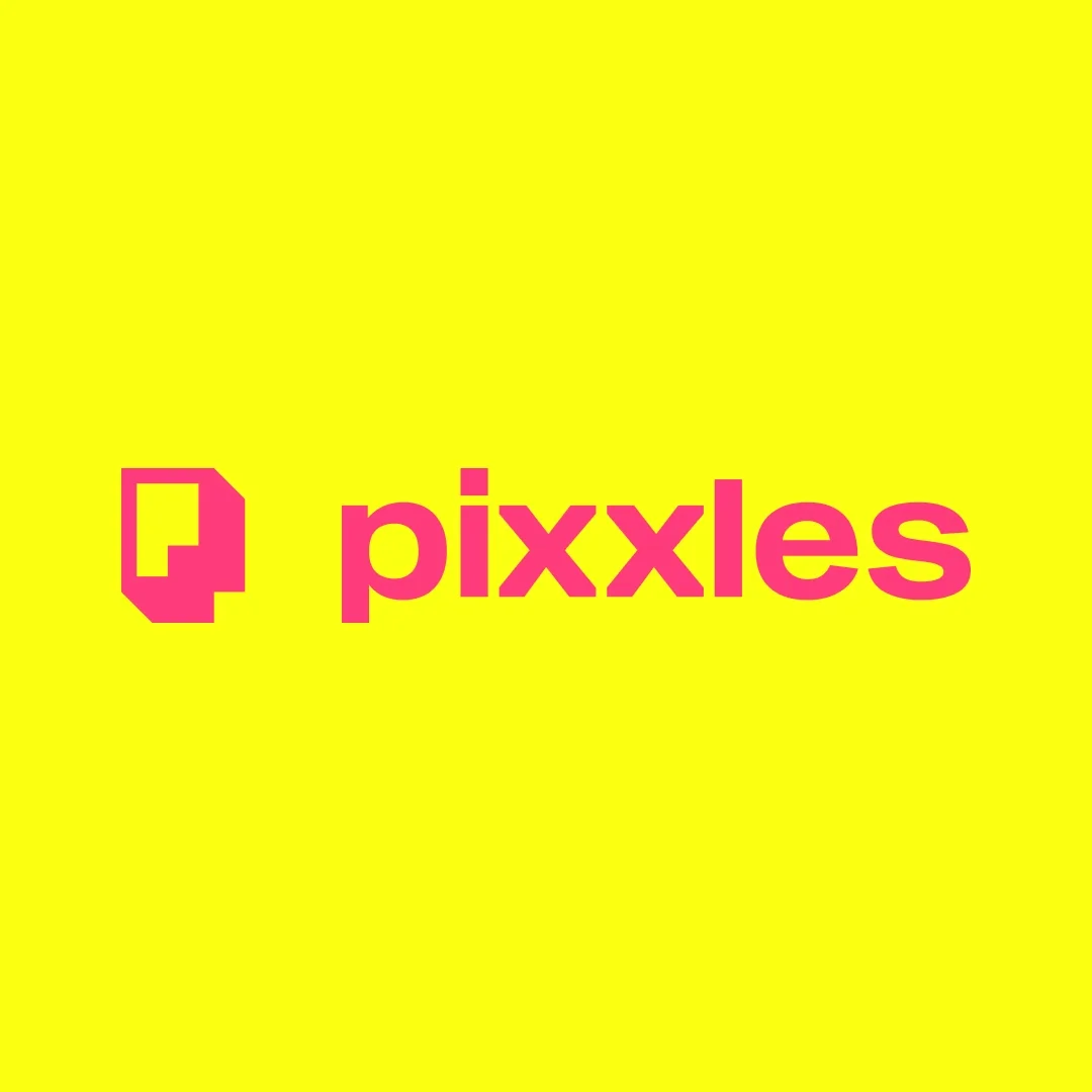
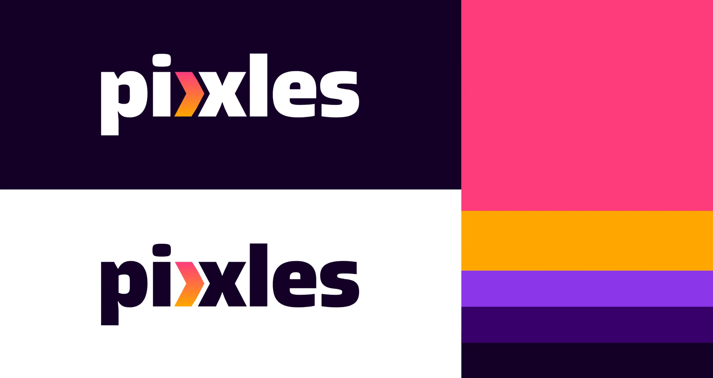
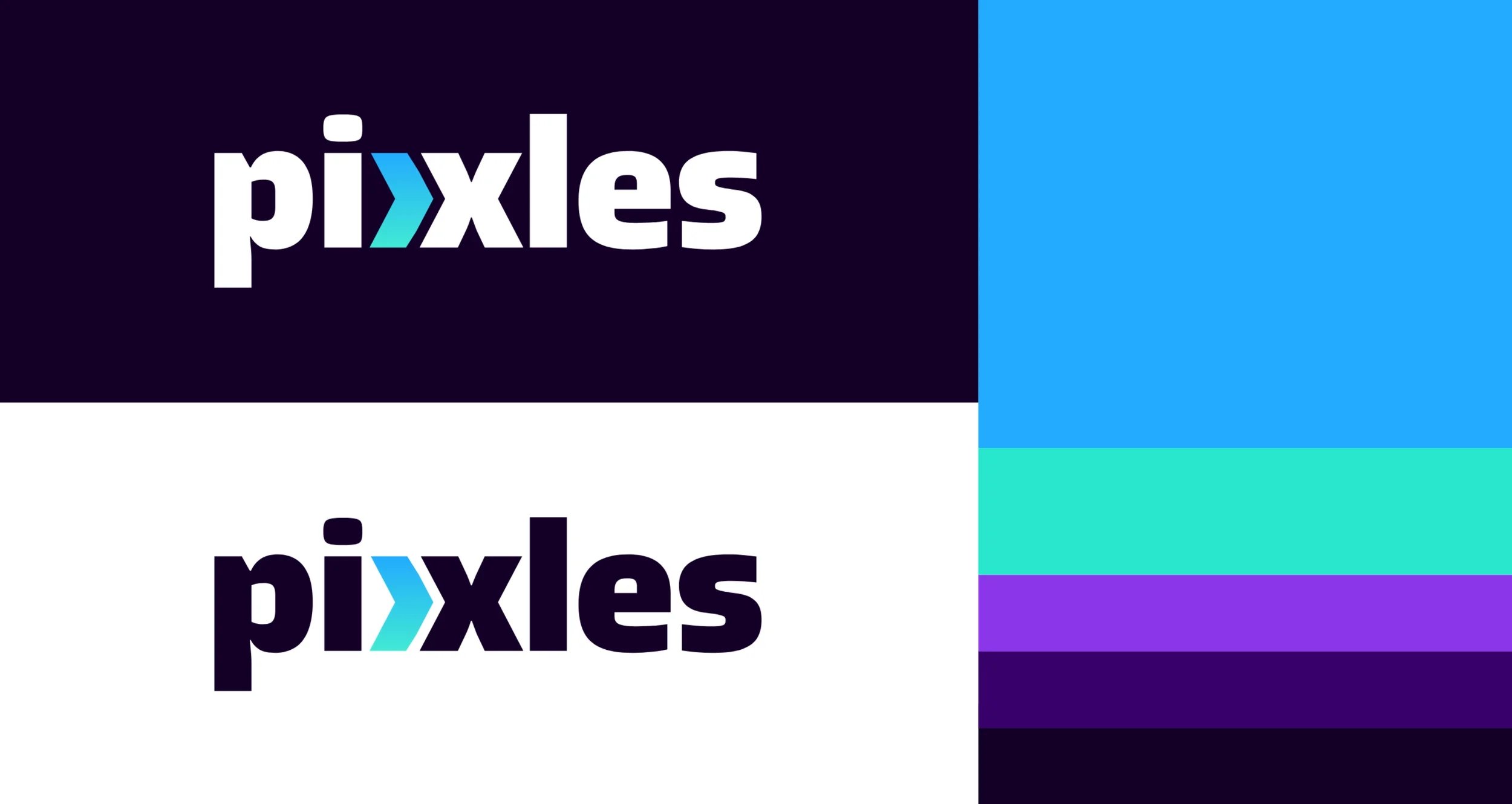
We landed on a primary logo featuring a glowing neon “xx” ligature in bright gradients, paired with a dark indigo background to keep things legible and grounded. Still bold and unapologetic, but also legible.


We introduced a vibrant, unapologetic palette: F*ckin' Fuschia, Neon Yellow, Hot Tangerine, Epic Azure, Mint Green, Twilight Violet, Dusk Purple, and Midnight Indigo. But here's the strategic part—we split the palette by audience. B2B materials use warmer tones (fuschia, orange, purple) to feel bold and professional. B2C materials use cooler tones (blue, mint, violet) to feel approachable and consumer-friendly. This let Pixxles speak to two distinct audiences while maintaining brand cohesion.
The result was a brand system that felt modern, energetic, and flexible enough to work across digital, print, B2B, and B2C without losing its edge.
The Campaign
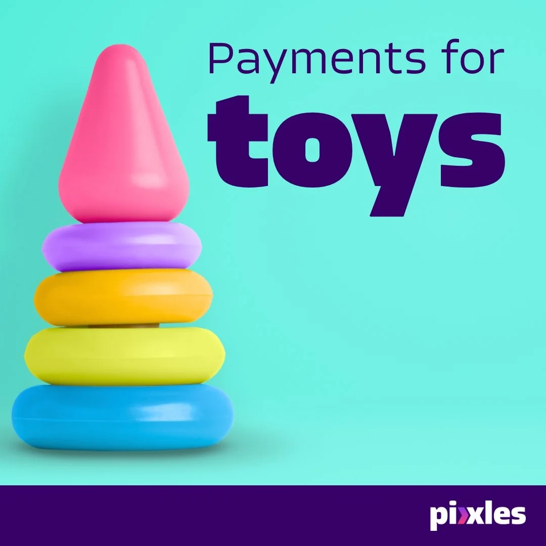
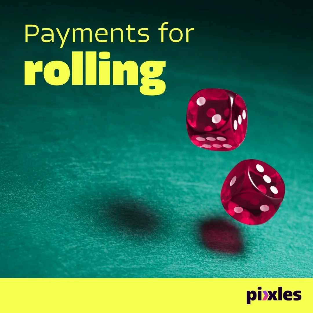
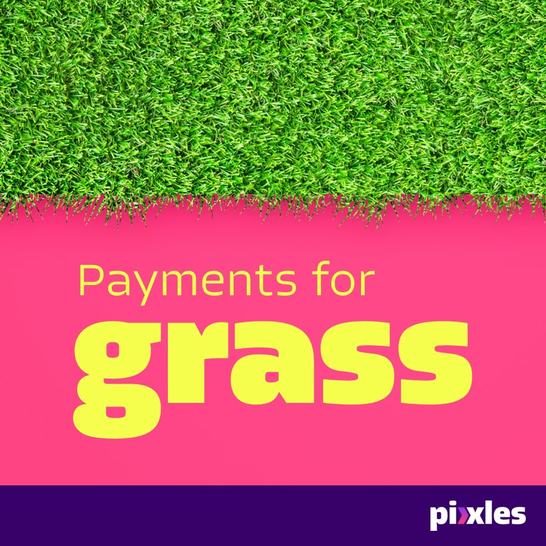
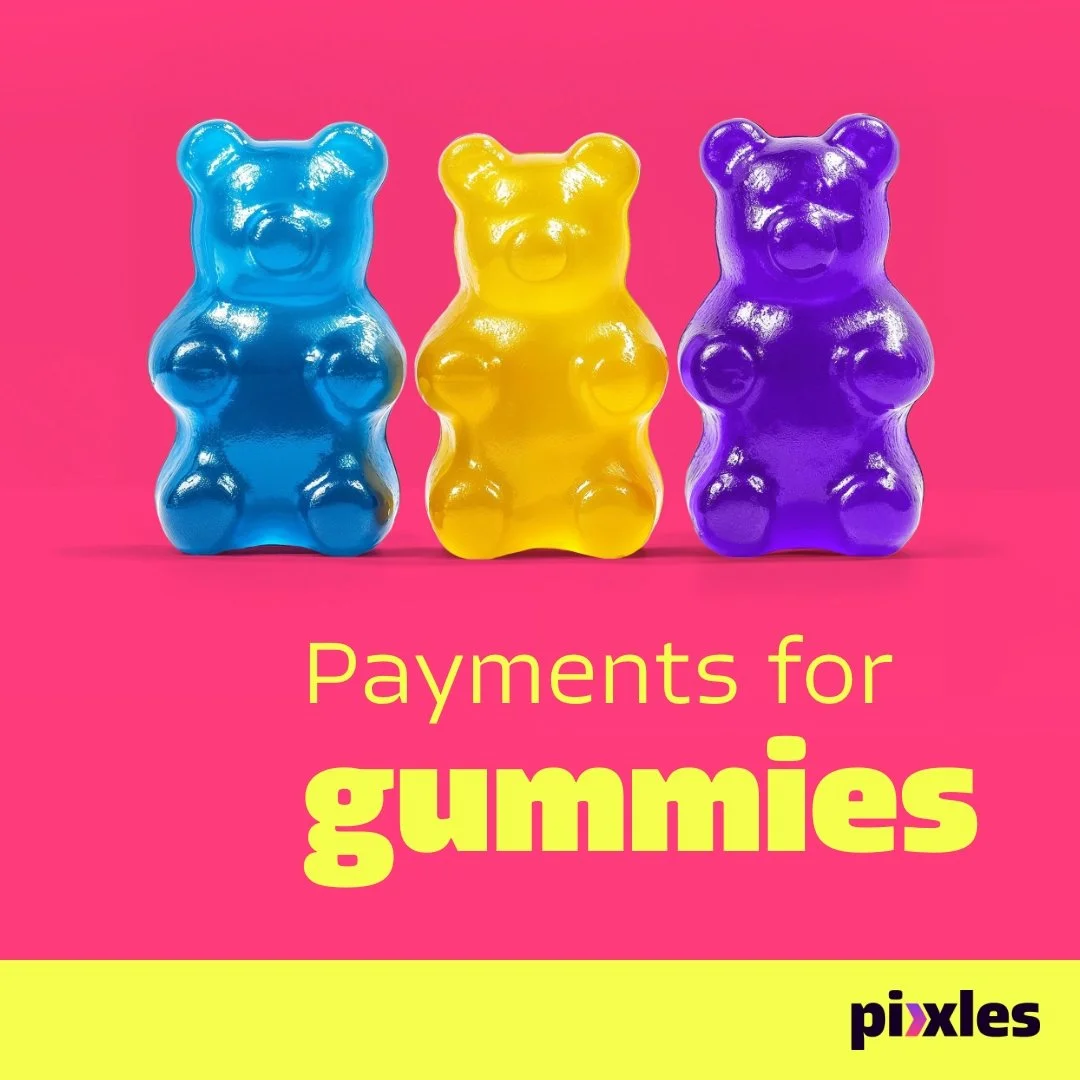
Working with an Associate Creative Director and copywriter, we developed a campaign concept around a simple, powerful idea: "Payments for whatever you're into."
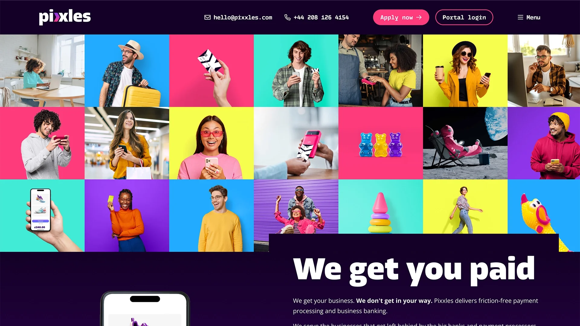
The concept spoke directly to Pixxles' core positioning—they don't judge, they don't gatekeep, they just help businesses accept payments. The creative featured diverse, vibrant imagery paired with bold typography and color blocking. The tone was confident, inclusive, and refreshingly human for fintech.

Visuals ranged from everyday transactions (someone buying a product, paying with a card) to more niche scenarios (a cannabis dispensary, an online creator accepting tips). The campaign worked because it didn't shy away from what makes Pixxles different—it leaned into it.
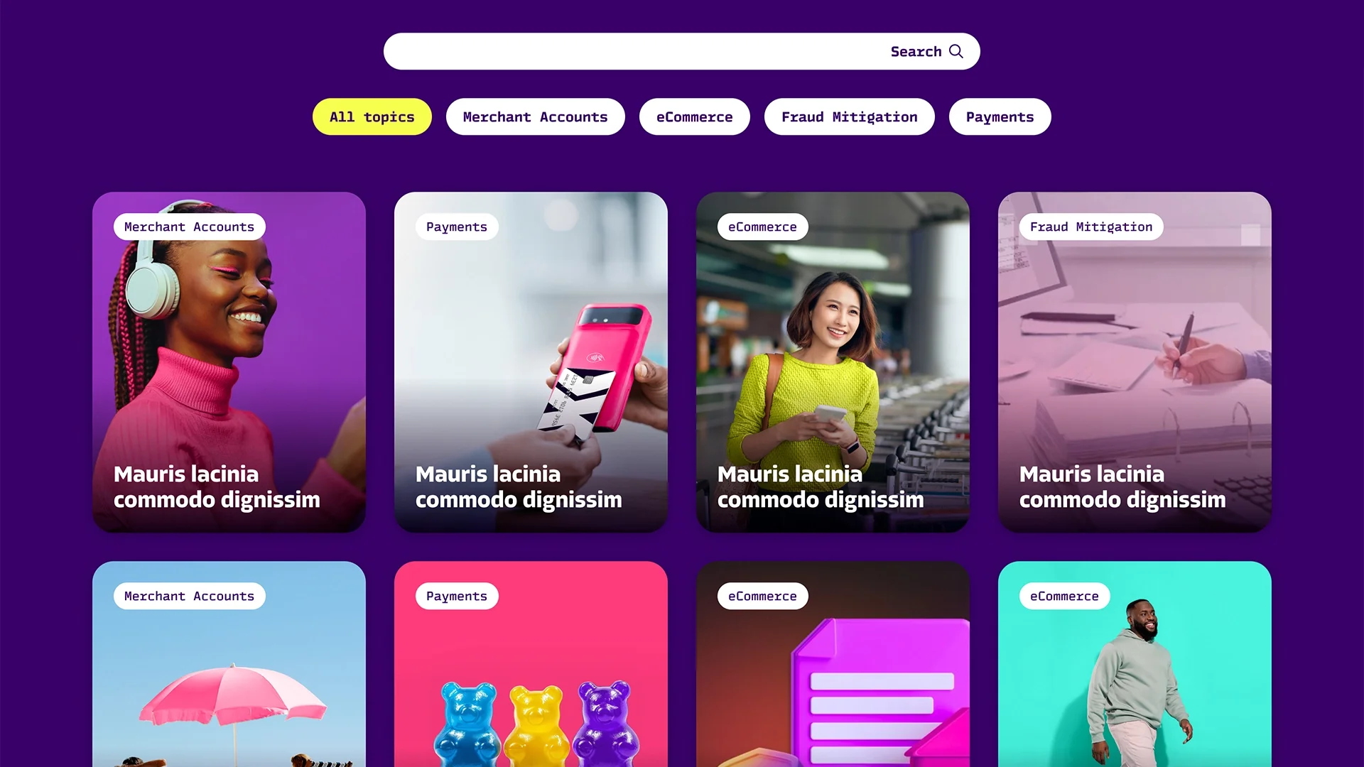
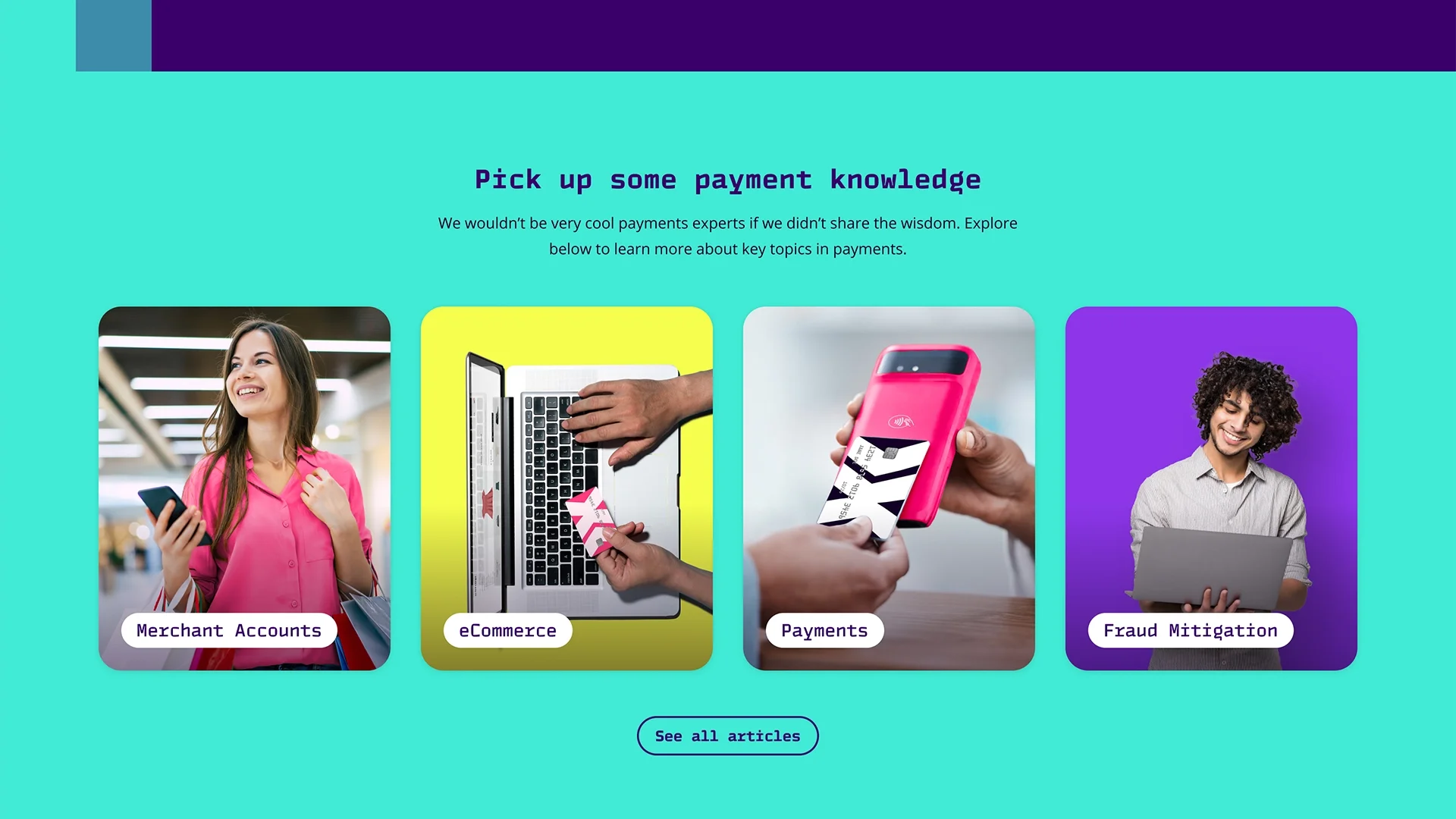
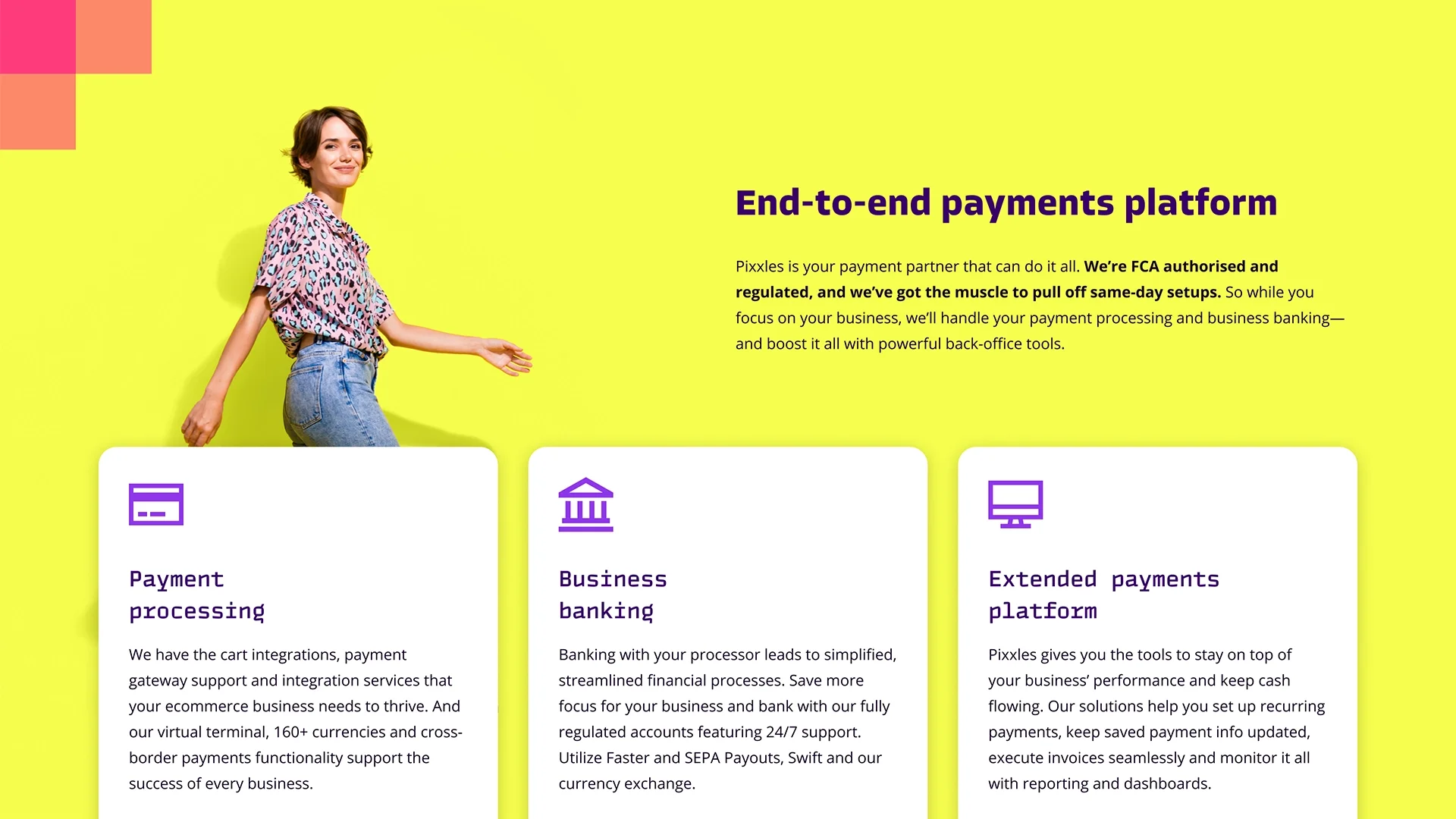
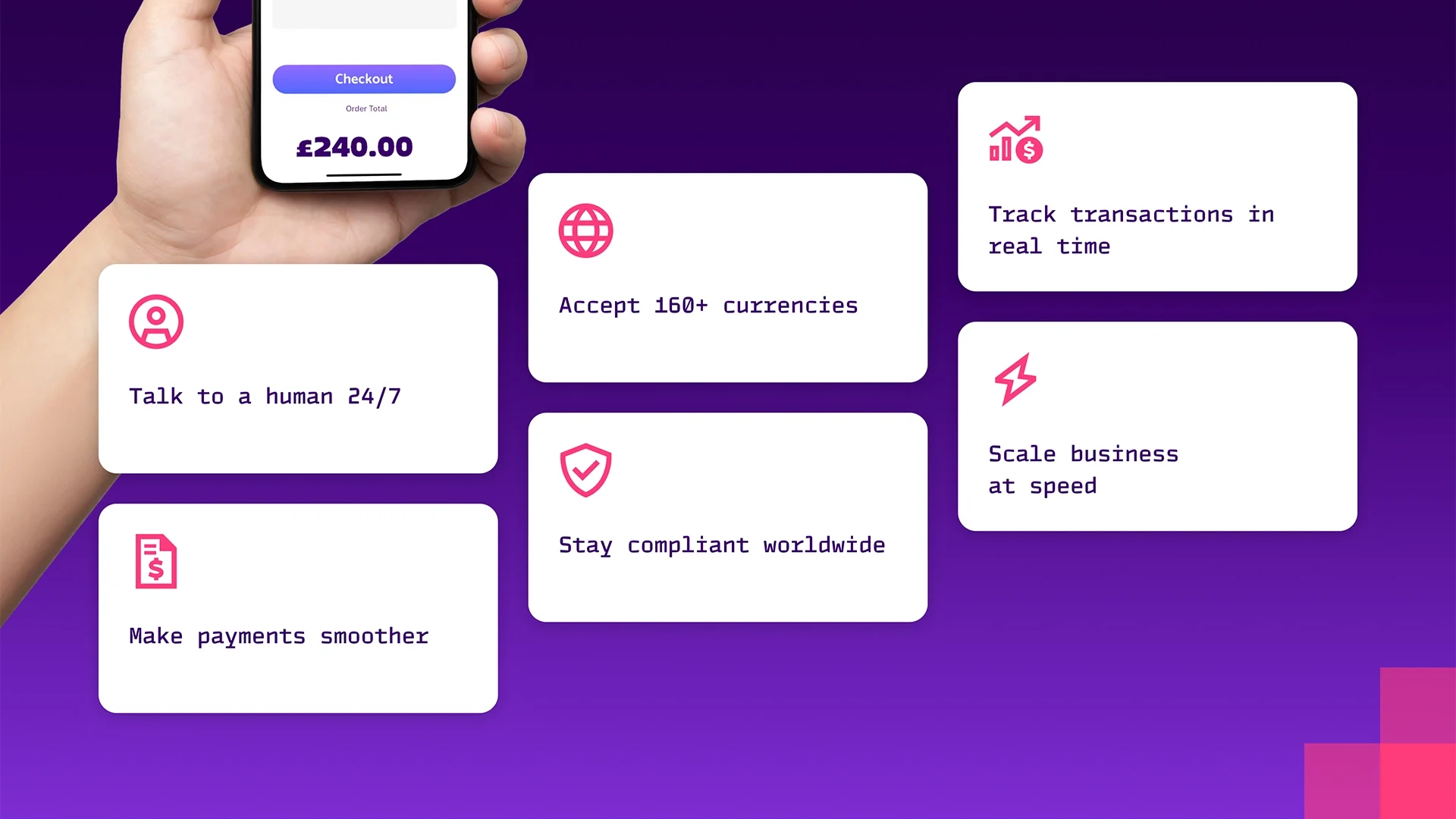
The website
We got six pages into the website redesign before the project unfortunately ended.
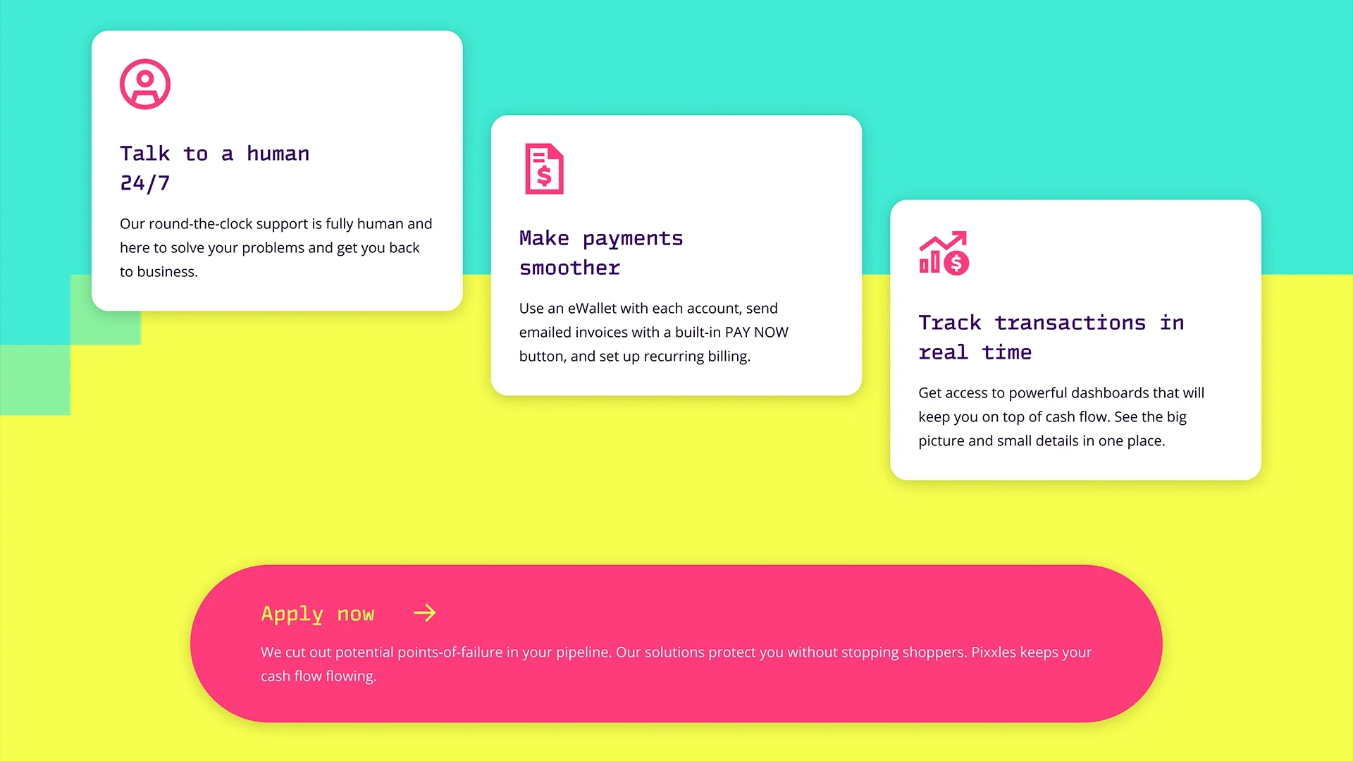
The design system prioritized bold color blocking, dynamic layouts, and conversion-focused CTAs. Each page was built to make Pixxles feel accessible, trustworthy, and distinctly not like every other payment processor. Headlines were punchy, body copy stayed concise, and the visuals balanced professionalism with personality.
The homepage opened with a strong value prop: “we get you paid,” and layered in trust signals (customer logos, security callouts) without feeling corporate or stiff. The B2B and B2C landing pages used different color palettes to speak directly to their respective audiences, while the product overview broke down features in a way that actually made sense.
Pixelated transitions and unique hover states were planned to make the site feel unique and on-brand without being too heavy for mobile usage.
Please pardon the lorem ipsum, the copy also never got completed.
The result
The project was discontinued before launch due to client circumstances. But the work itself demonstrates how to take a bland fintech brand and turn it into something memorable. The brand refresh gave Pixxles a visual identity that actually matched their positioning—modern, bold, and built for businesses that don't fit the mold. The campaign concept showed how to break through in a crowded space by leaning into what makes you different. And the website design laid the foundation for a conversion-focused digital presence.
Sometimes the best work doesn't make it to market. But the strategic thinking and creative execution here proved that even "risky" industries deserve brands that feel confident, polished, and ready to compete.